Emotion Tracking App and Responsive Website Case Study
About the project:
FEELS is a mental health tracking app and responsive website. It is a tool for everyday people to understand and take better care of their mental health and for mental health professionals to help their clients more efficiently.
My role:
UX designer for the app and responsive website from inception to delivery. Some of my responsibilities were: user research, competitive research, interviews, wireframing, visual design, low and high-fidelity prototyping, usability studies, and design iterations.
Target Audience:
Mental health professionals and people interested in tracking their mental health.

Project goal
Mental health is still a highly stigmatized issue that needs more attention. People lack general knowledge about their emotions and how surrounding conditions affect them. This project aims to design a tool to help people easily track their feelings and correlating situations.
Understanding the user
For this project, I conducted informal user interviews with people interested in tracking their mental health as well as mental health professionals. The feedback made it clear that people see a point in mental health tracking. However, most mood-tracking apps lack descriptive options, which makes looking back at statistics difficult, thus defeating the purpose of mood-tracking itself. I also conducted a competitive audit to find gaps to fill and opportunities to address with the app.
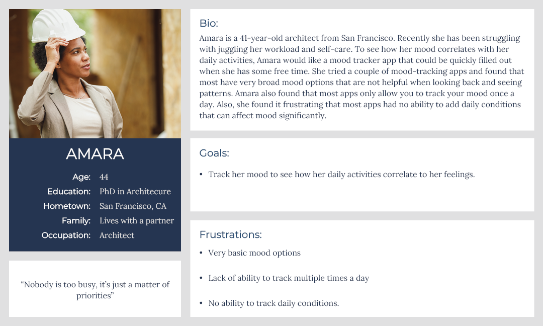
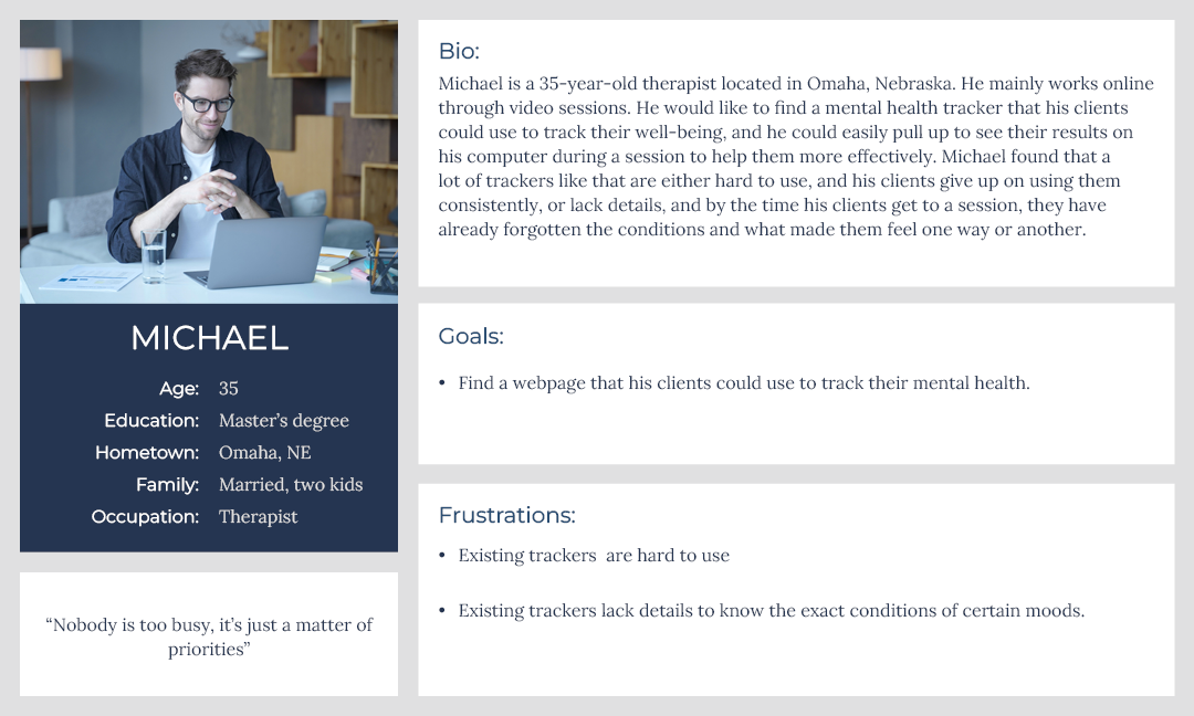
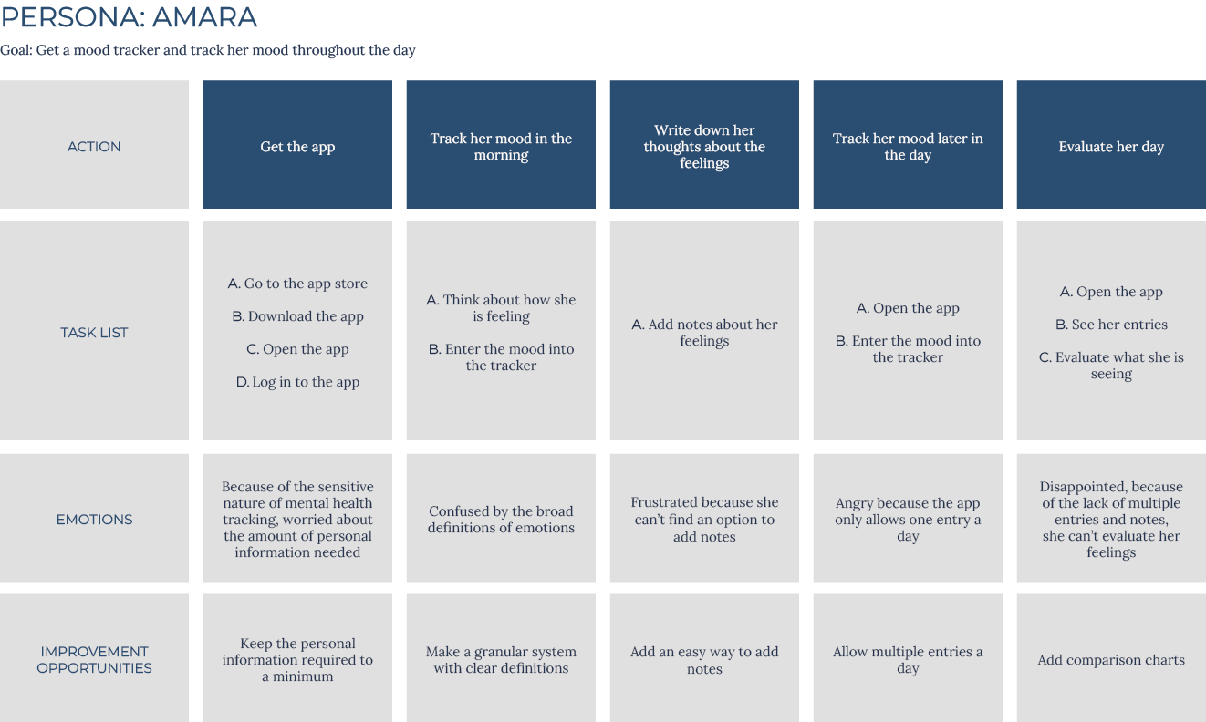
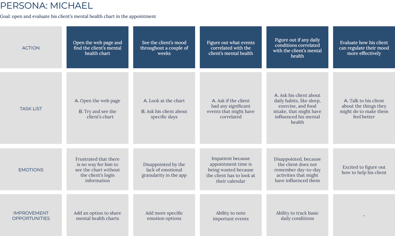
User Personas:
After identifying user problems, I created user personas and journey maps. Mapping their journeys revealed what functions users would find important from personal and professional perspectives.
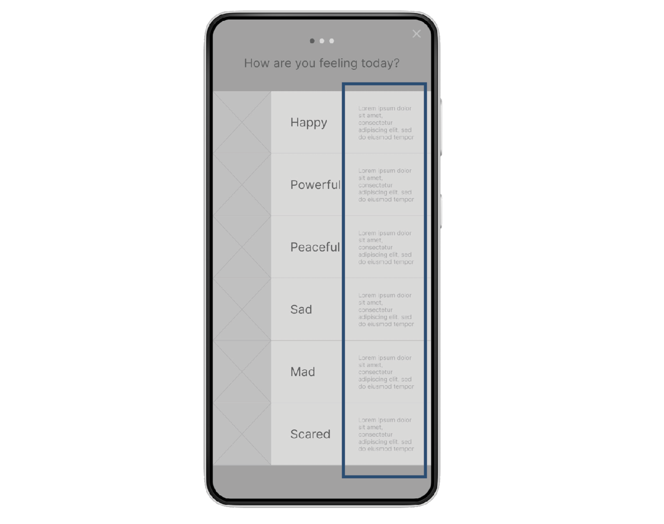
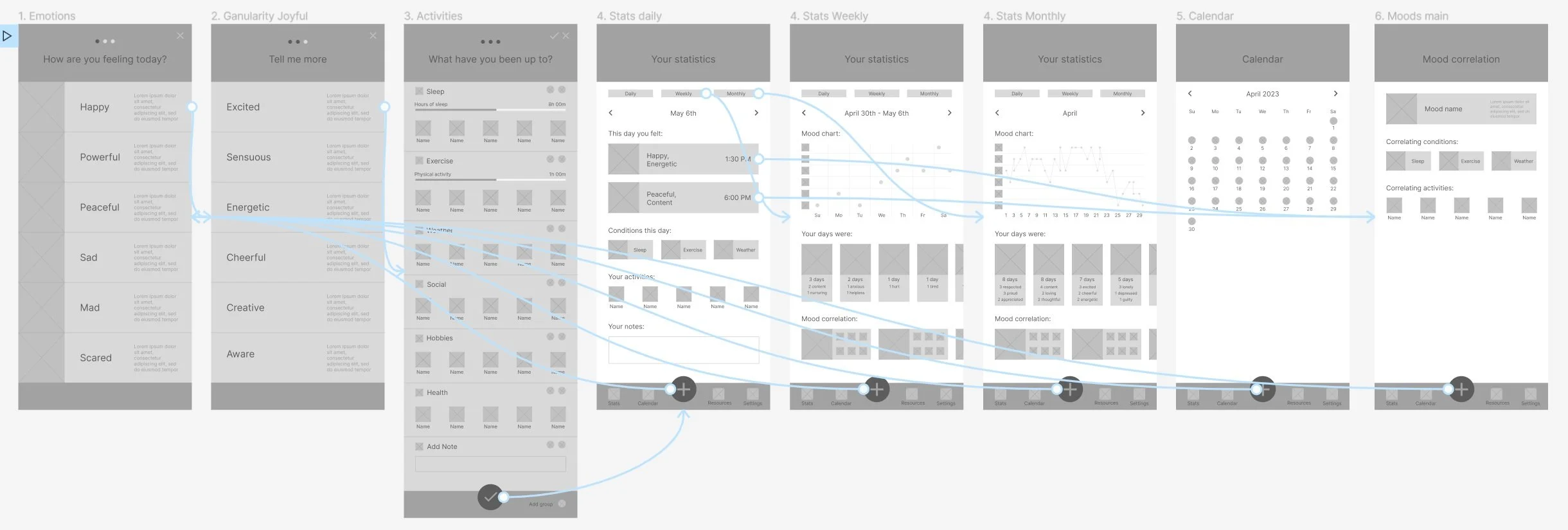
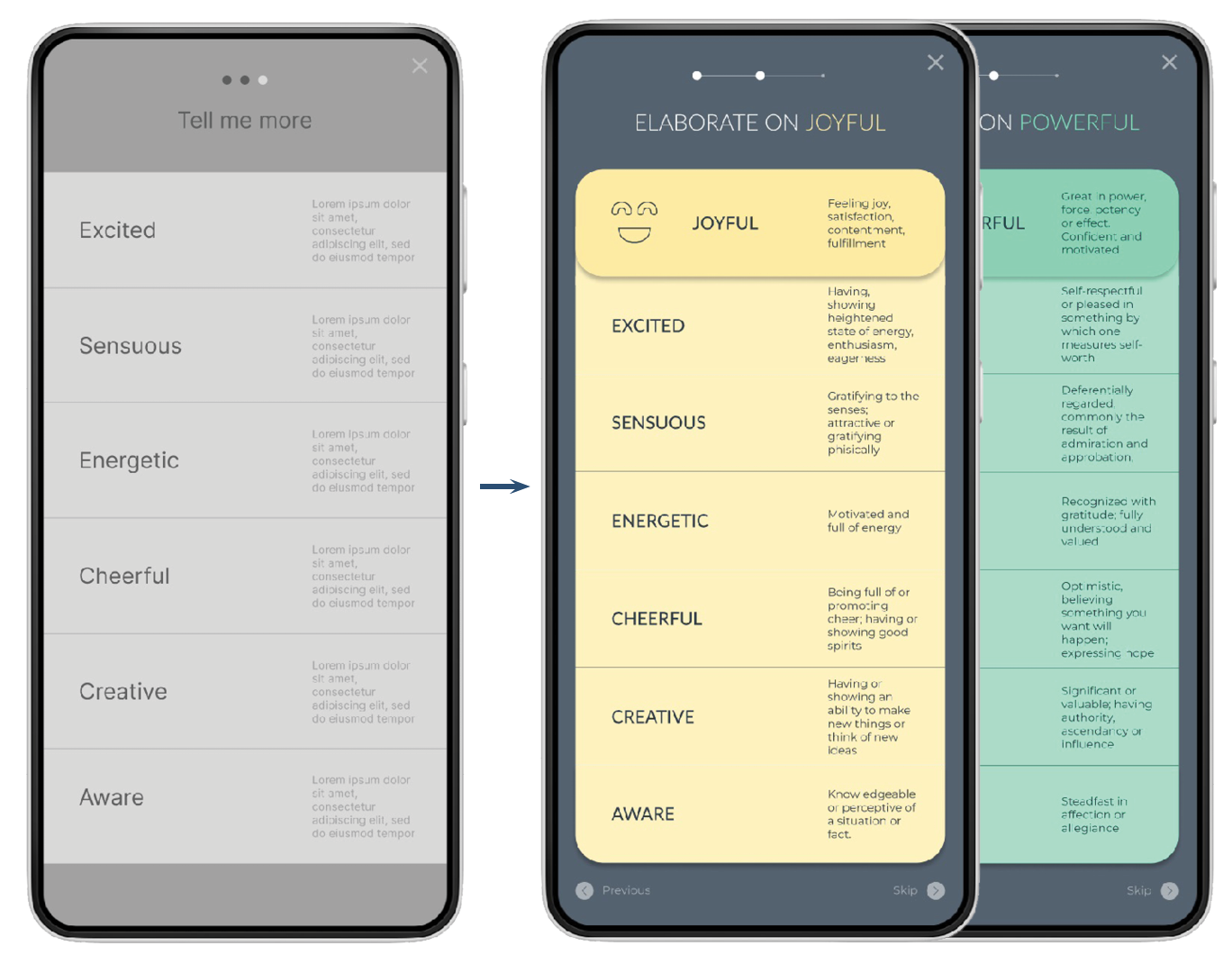
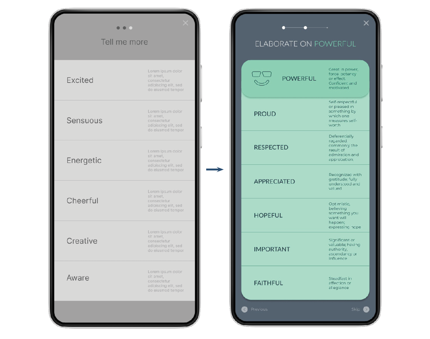
I based my initial app structure on the Feeling Wheel by Dr. Gloria Willcox. In her wheel, emotions start with six primary emotions, then granulate to six secondary ones. From there, I did multiple ideation exercises to devise ways to enter them. I sketched some paper wireframes and landed on a three-step emotion entry system: starting with the primary descriptive options, then going to secondary emotions, and finishing with surrounding conditions and activities. With this system, users should make detailed entries with ease.
Starting the design
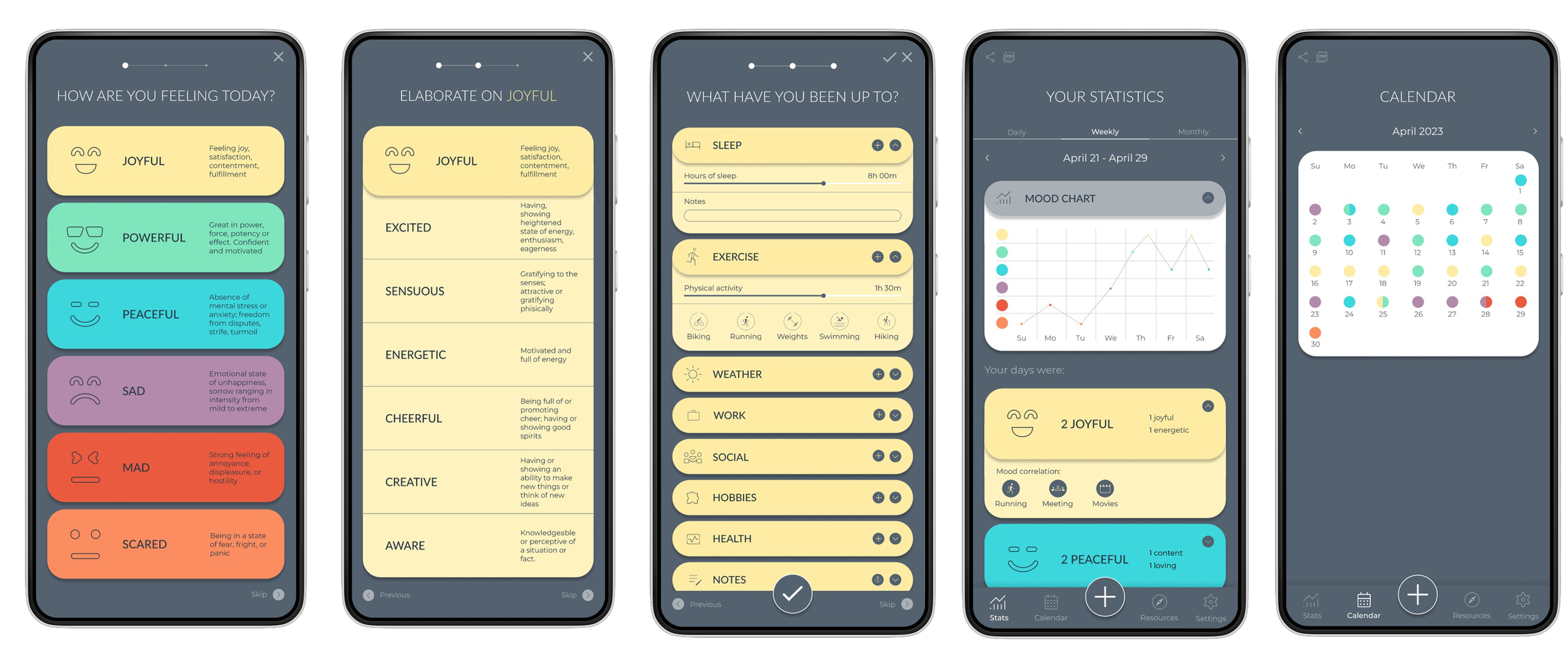
Three step entry system should make entering easy.
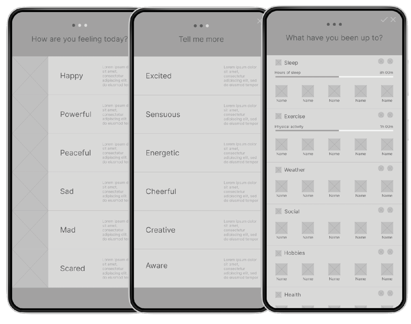
Emotion descriptions in the entry system make it easy for users to understand the emotions themselves.
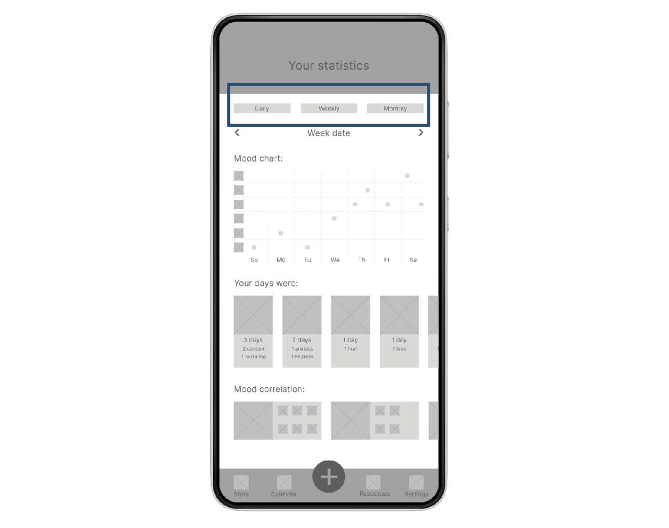
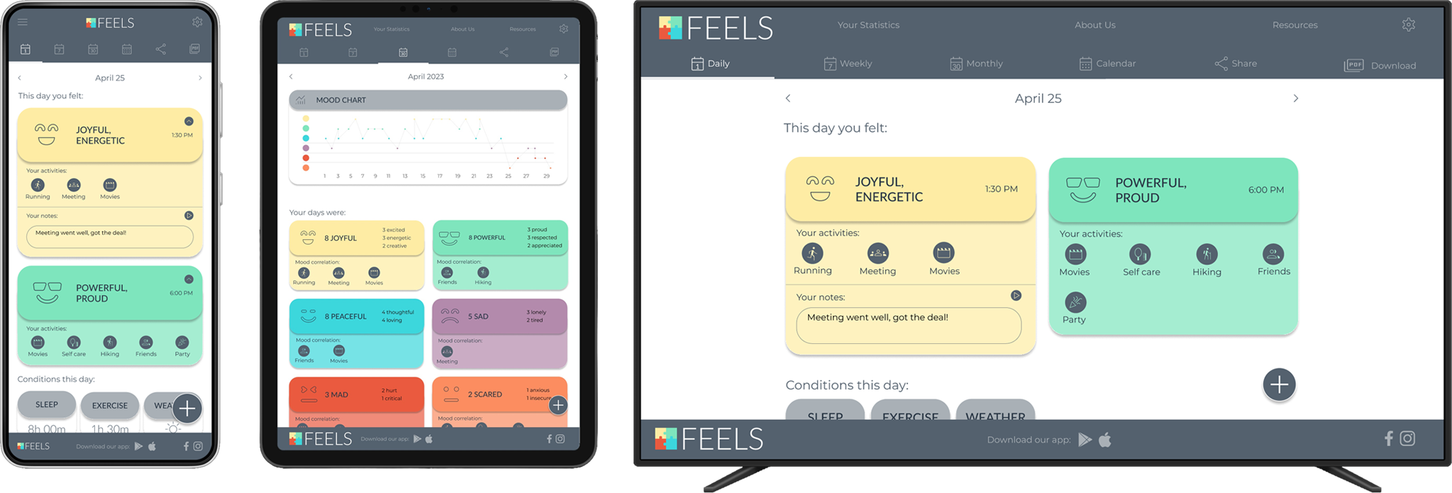
Daily, Weekly, and Monthly statistics pages make it easy for users to track, compare and evaluate their emotions.
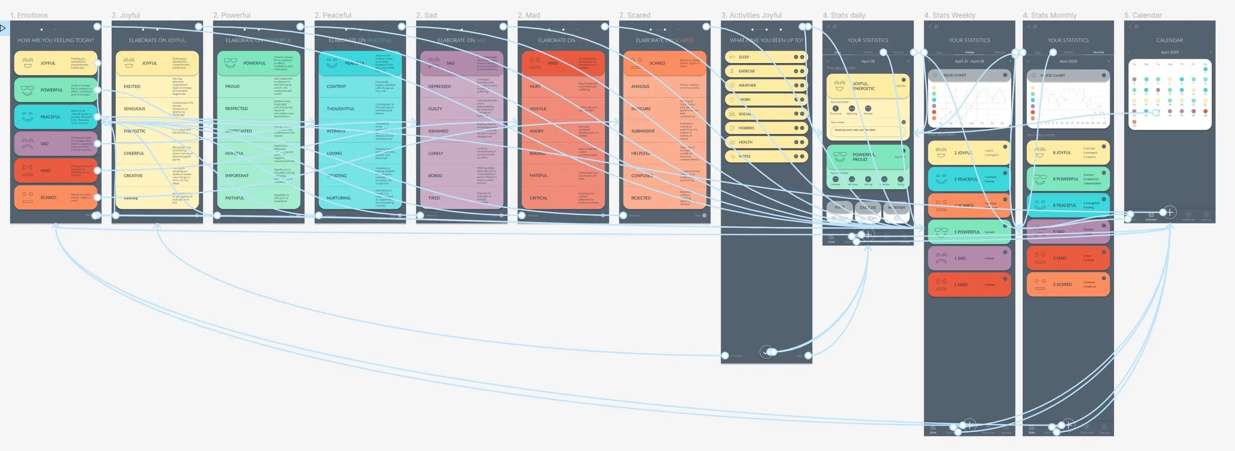
To prepare for usability testing, I created a low-fidelity prototype that connected the main user flow: emotion entry and statistics.
Low fidelity prototype:
Usability study findings:

Progress indicator
People tried to swipe on the progress indicator

Entry navigation
People wanted “Skip” and “Previous” buttons in the entry navigation

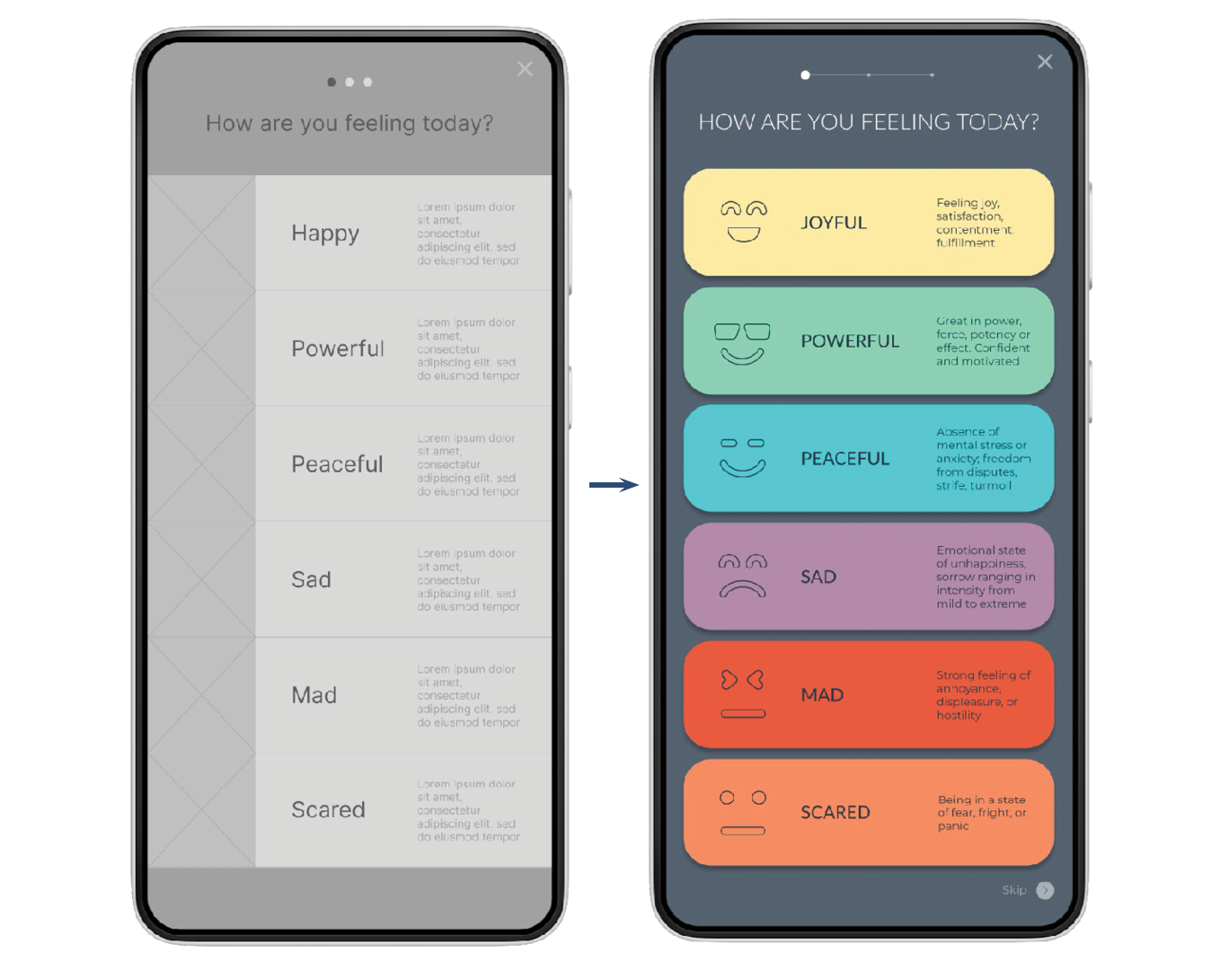
Granularity
People were confused by the connection between primary and secondary emotions
Refining the design
Granularity
Because people needed clarification about the emotion granularity, the title in the secondary emotion screen was changed to reflect the connection between primary and secondary emotions. To make the relationship even more clear, I used color coding.
Entry Navigation
“Previous” and “Skip” buttons were added to the Emotion Entry navigation.
Refined mockups and high fidelity prototype:
To prepare for additional usability testing, I created a high-fidelity prototype for the entire user experience.
Progress indicator
Based on the usability study, I changed the progress bar to a more familiar form.
The design for the responsive website included mobile, tablet, and desktop sizes. I optimized the designs to fit each size's specific needs and screen layouts.
Responsive design
Final Thoughts:
While designing this tool, I learned that researching and listening to users makes it possible to identify gaps in existing products and create something that might fill them. I also learned the key differences between dedicated and responsive web apps and how to implement that.
In the future, I would like to conduct another round of usability studies and add educational resources about mental health.