Virtual Art Gallery Tour App Case Study
About the project:
ContextArt is a Virtual Art Gallery Tour App where users can experience and explore art from the comfort of their homes and on their own time. It is created for busy art lovers without the time and resources to visit physical art galleries.
My role:
UX designer designing an app from inception to delivery. Some of my responsibilities were: user research, competitive research, interviews, wireframing, visual design, low and high fidelity prototyping, usability studies, and design iterations.
Target Audience:
Busy art enthusiasts, artists, and casual art lovers without time or resources to visit physical art galleries.

Project goal
Create an app that allows people to experience art from anywhere at any time.
Understanding the user
I conducted informal interviews with artists and art lovers for this project. From interviews and empathy maps, user problems were identified:

Time
Adults with full-time jobs are too busy to visit physical art galleries because it is time-consuming.

Access
People that live in smaller cities don’t have
access to many art galleries.

Financial constraints
Visiting a lot of galleries can get expensive
with the ticket prices and travel costs.

Feeling lost
It is easy to get overwhelmed in an art gallery. A lack of directions and descriptions can make people feel lost, disengaged with the art, and lose motivation.
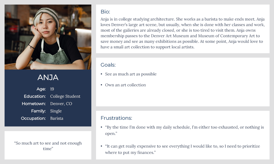
User Personas:
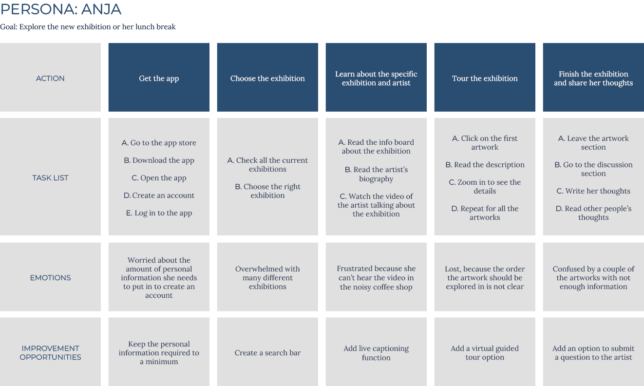
After identifying user problems, I created user personas and journey maps. Mapping Anja’s journey revealed what functions in the tour app would be very important for the user.
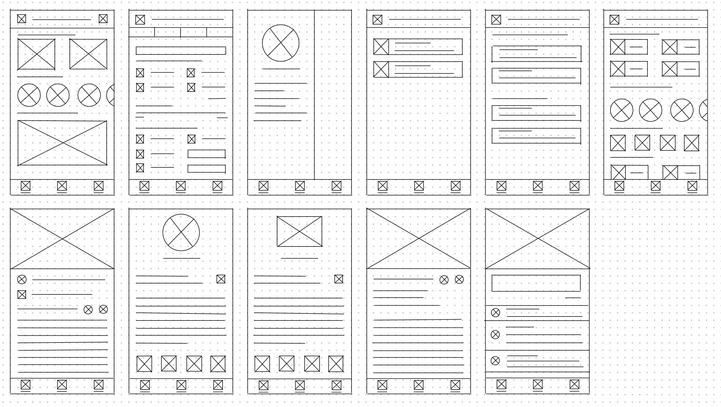
I started the design process by drafting multiple iterations of each screen on paper. By quickly sketching them, I had a chance to explore many various ideas and see what works and what does not. I constantly went back and forth between the screens to land on a system that made sense.
Starting the design
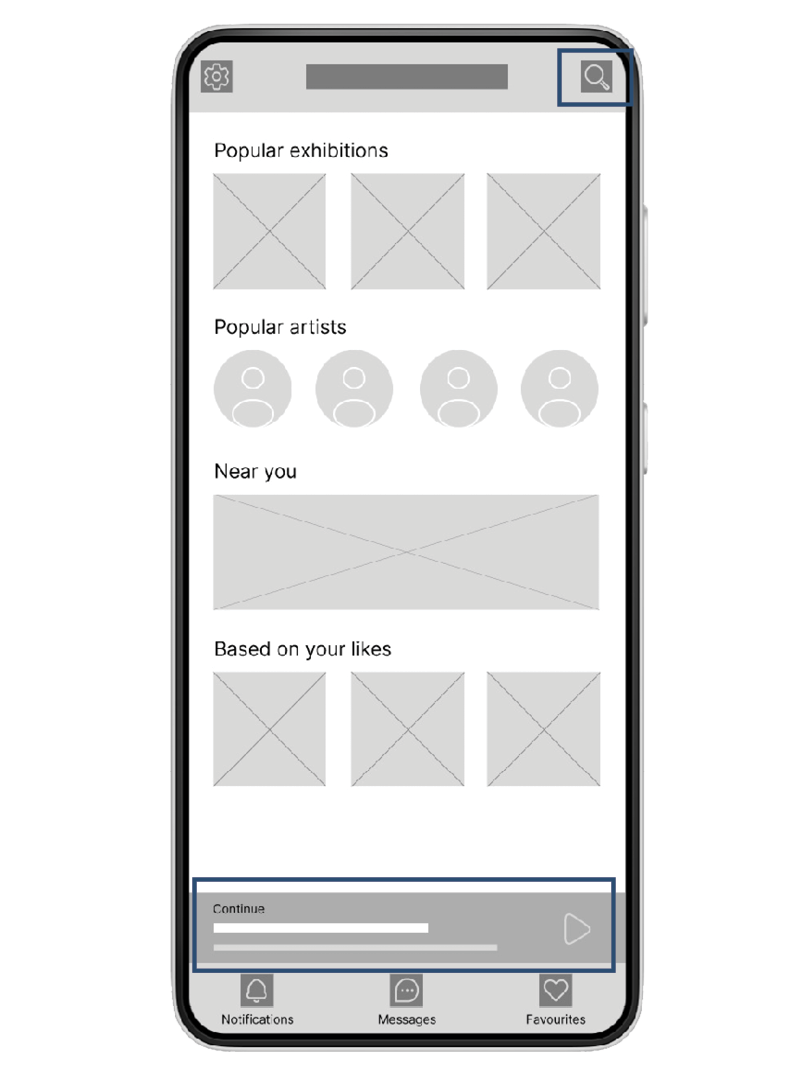
One of the primary user pain points found through user research was the lack of time to explore physical art galleries. Having the ability to pause and continue the tour on the user’s schedule was very important. I also wanted to make an easy and straightforward way to find the exhibition in mind:
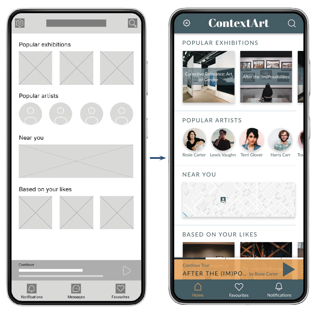
A clear search button makes it easy for users to find the exhibition that they want to see
The progress bar at the bottom of the screen makes it easy to continue the tour started earlier without the need to search for the exhibition again.
Another pain point expressed in user research was the need for more directions and detailed descriptions in art galleries. It was important to have structured tours for users not to feel overwhelmed and lost:
Structured tour will help users not lose motivation
Detailed audio and written artwork descriptions will help users better understand what they are seeing.
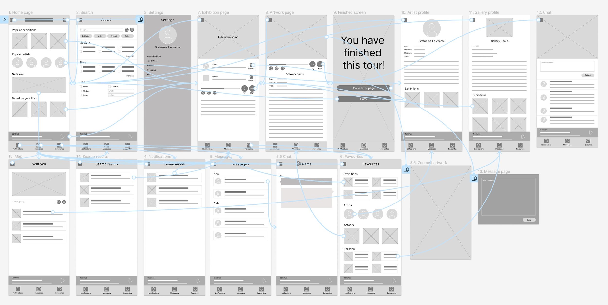
While creating a low-fidelity prototype, I wanted to understand how each screen would interact with every other screen and to make sure that there were no points where the user could get stuck with nowhere to go.
Low fidelity prototype:
I conducted two rounds of usability studies. Findings from the first study helped fix the issues from wireframes to mockups. The second study helped refine the high-fidelity prototypes with finishing touches.
Usability study findings:
Round one findings:
Users need more cues on the
navigation of the app
Users need a more obvious way to
enlarge and quit artwork
Users need a more intuitive way to
navigate the tour
Messaging function is unnecessary
Round two findings
Users need multiple ways to navigate the tour forward and backward
Users want to see how much tour is left before resuming it
Users want a list of all available exhibitions
Refining the design
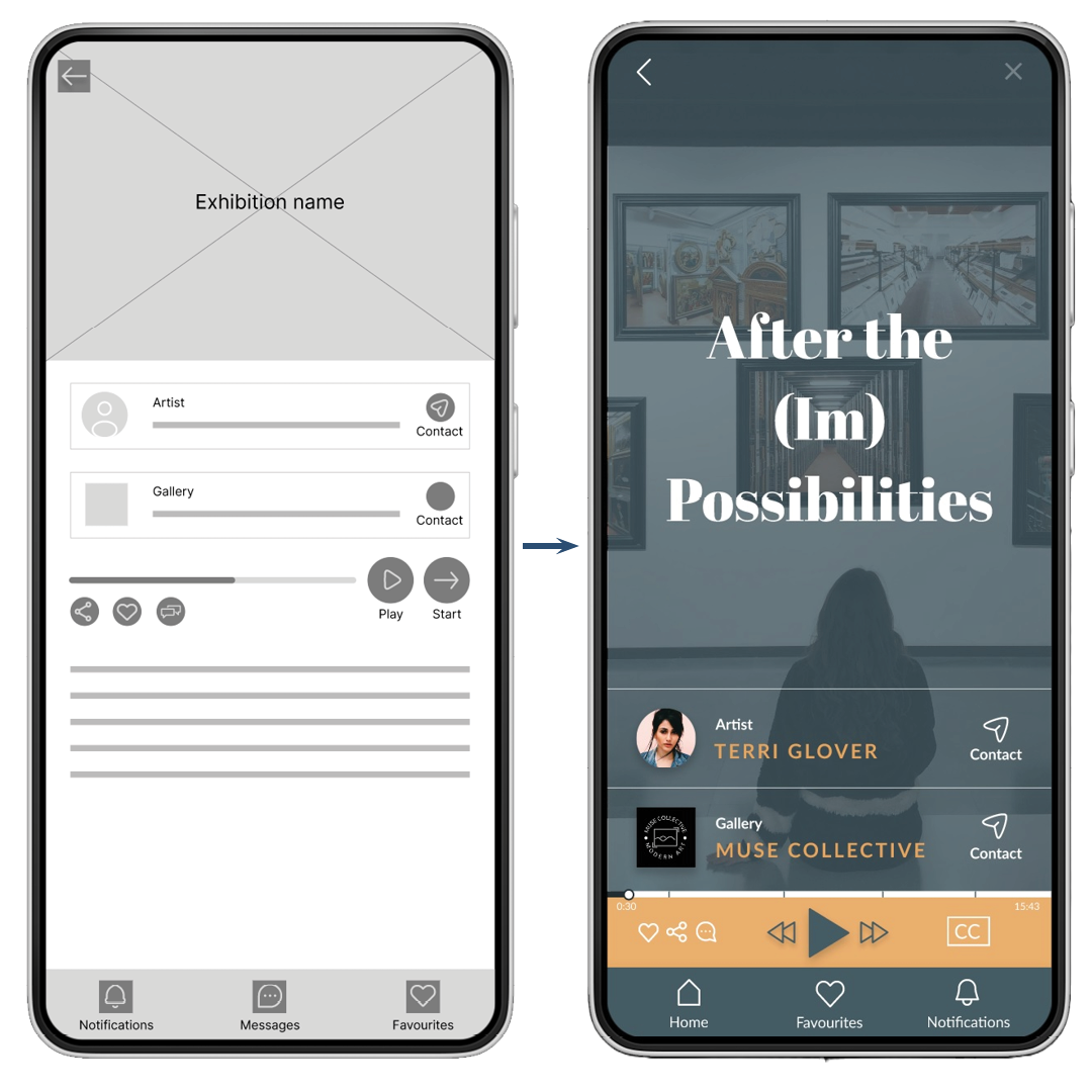
Exhibition page
To make the tour navigation more intuitive, changes made were:
A separate bar for the player, highlighting the player function, with a play button front and center
for the audio tourSimple “Next” and “Previous” buttons to make navigation as straightforward as possible
Adding function to forward and backward the tour by moving the marker on the progress bar
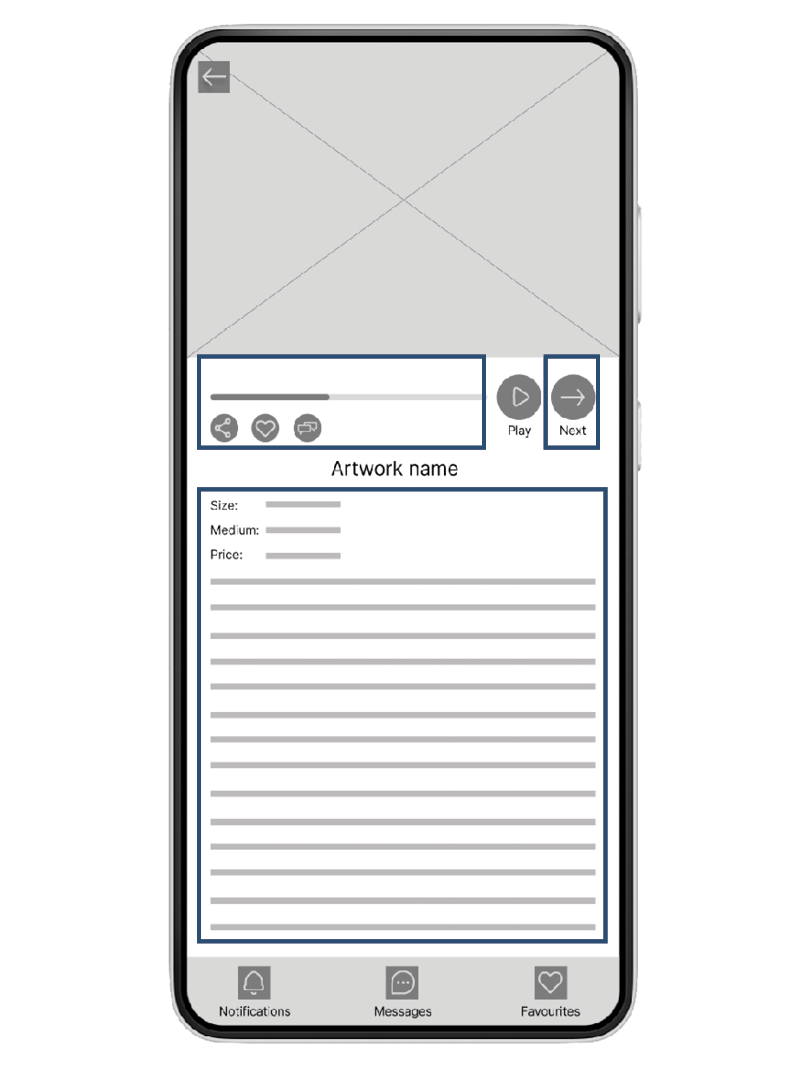
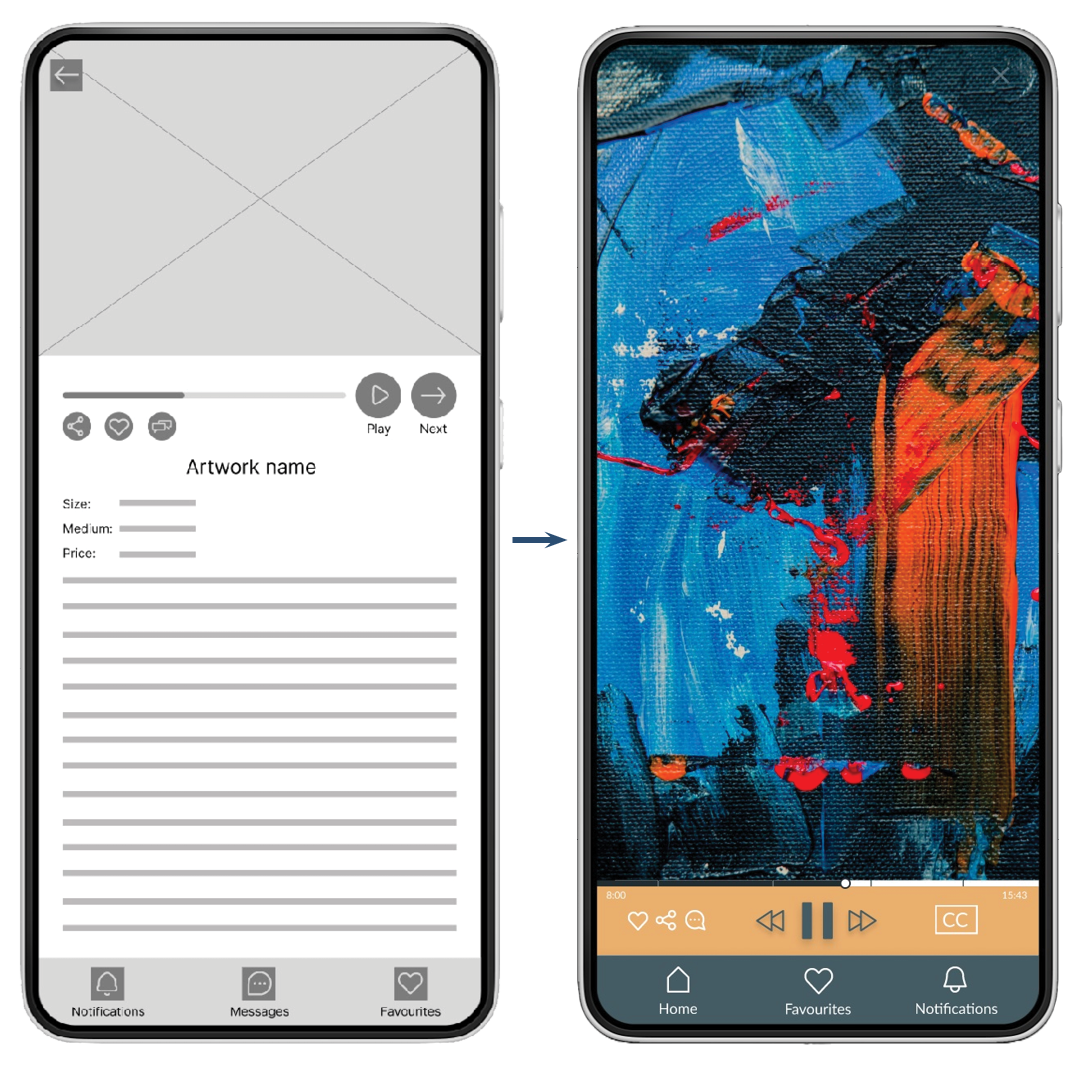
Artwork page
To eliminate the confusion about enlarging the artwork and quitting the screen, changes made were:
Artwork front and center eliminates the need to click on the artwork to enlarge
A small player bar doesn’t distract from the art
Paused tour
To let users know how much of paused tour is left while not in the main exhibition screen, changes made were:
A small progress bar added on top of the player
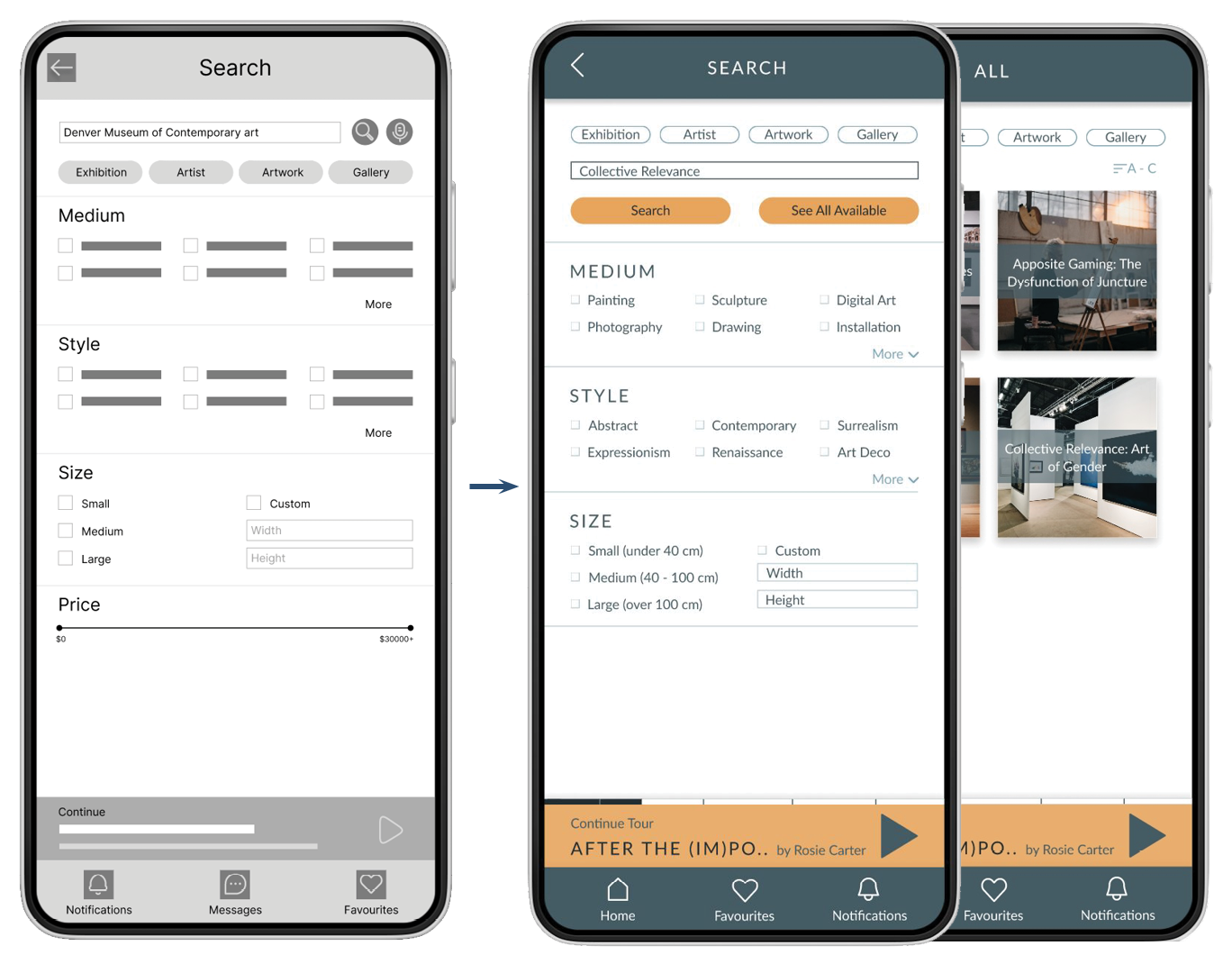
List of all available exhibitions
To make exploring straightforward and more accessible to the user, changes made were:
An “All Available” button added to the search screen
Screens for all available exhibitions, artists, artworks, and galleries were added
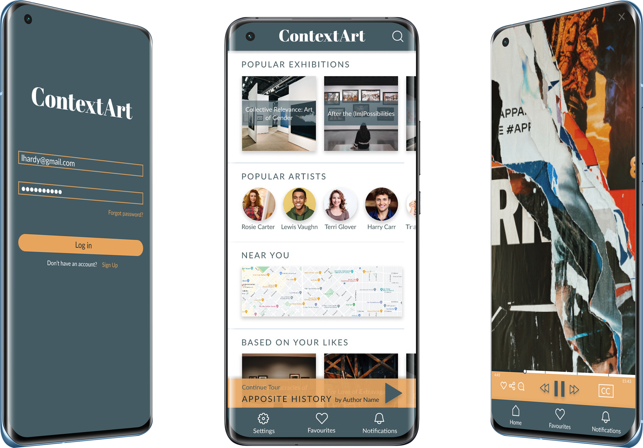
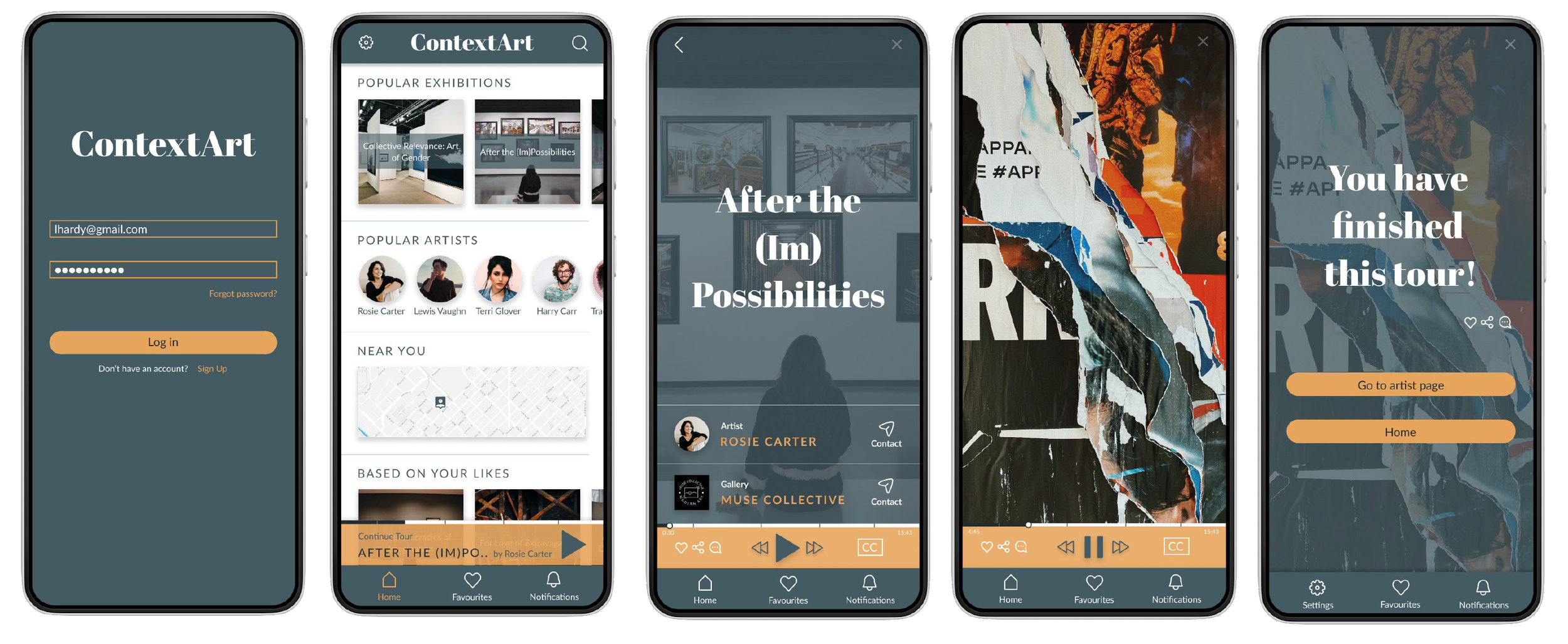
Refined mockups and high fidelity prototype:
Refined mockups and high-fidelity prototype present the main user flow and finished look of the app to users.
While designing the app, I learned that testing is crucial. I gained insights to make the app more practical and functional.
Final Thoughts:
In the future, I would like to conduct another round of usability studies to see if the changes implemented addressed user pain points effectively. Also, I would like to conduct more research to find out if any other functions would be helpful in the user journey.