Pet Adoption Flow for an Animal Shelter Case Study
About the project:
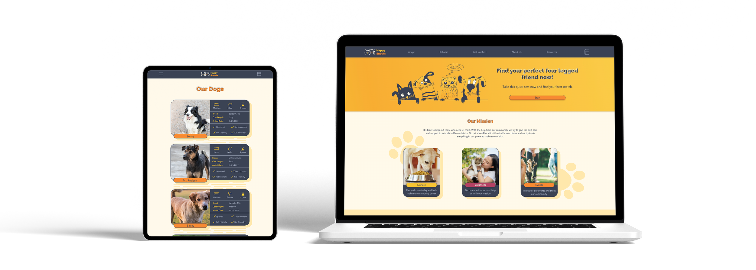
Happy Snouts is an animal shelter offering an easy way to adopt a pet. Shelter aims to make the adoption process straightforward, easy, and hassle-free to motivate people to adopt.
My role:
UX designer leading the adoption flow and visual identity design. My responsibilities included conducting interviews, competitive audits, wireframing, prototyping, conducting usability studies, iterating on designs, and responsive design.
Target Audience:
Anybody who would like to have a pet at some point.

Project goal
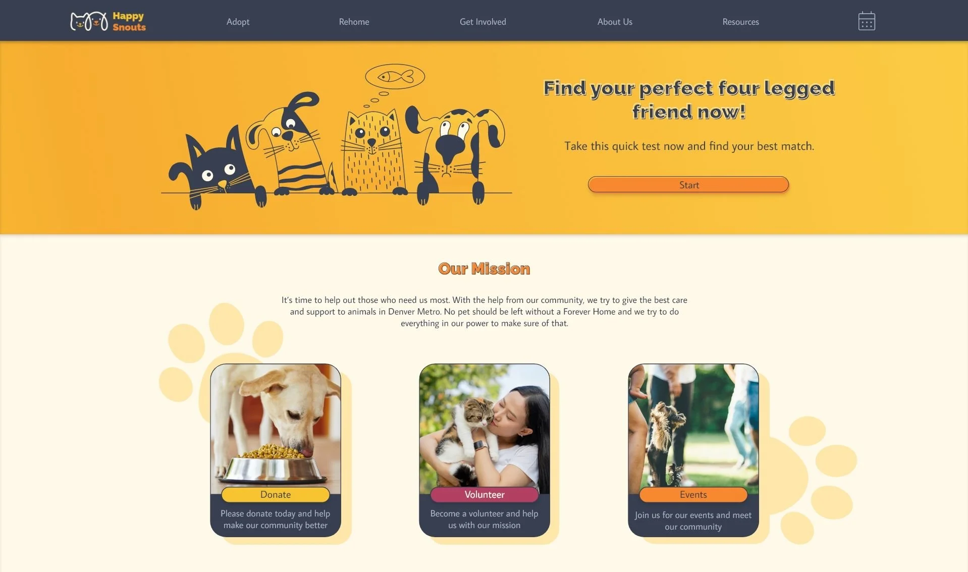
Design a website with an adoption flow that makes choosing the right pet easy, scheduling clear, and the process hassle-free so more people choose adoption.
Understanding the user
For this project, I conducted informal interviews with pet owners and people who plan to be pet owners. Then I turned them into empathy maps to better understand why more people don’t choose to adopt when getting a pet. User problems identified were:

Finding the right pet
Finding the right pet for people’s needs and lifestyles is complicated, mainly because most animal shelter websites lack filters.

Pet descriptions
It is easy to get overwhelmed when trying to adopt a pet. The lack of clear but detailed descriptions complicates the process, and people lose motivation to adopt.

Scheduling online
Busy people need an option to schedule
meetings online so they don’t miss their
chance to meet their pet.

Adoption process
Because of no ability to adopt online from the comfort of their home after meeting the pet, users feel like they need to rush their decision about adopting the pet.
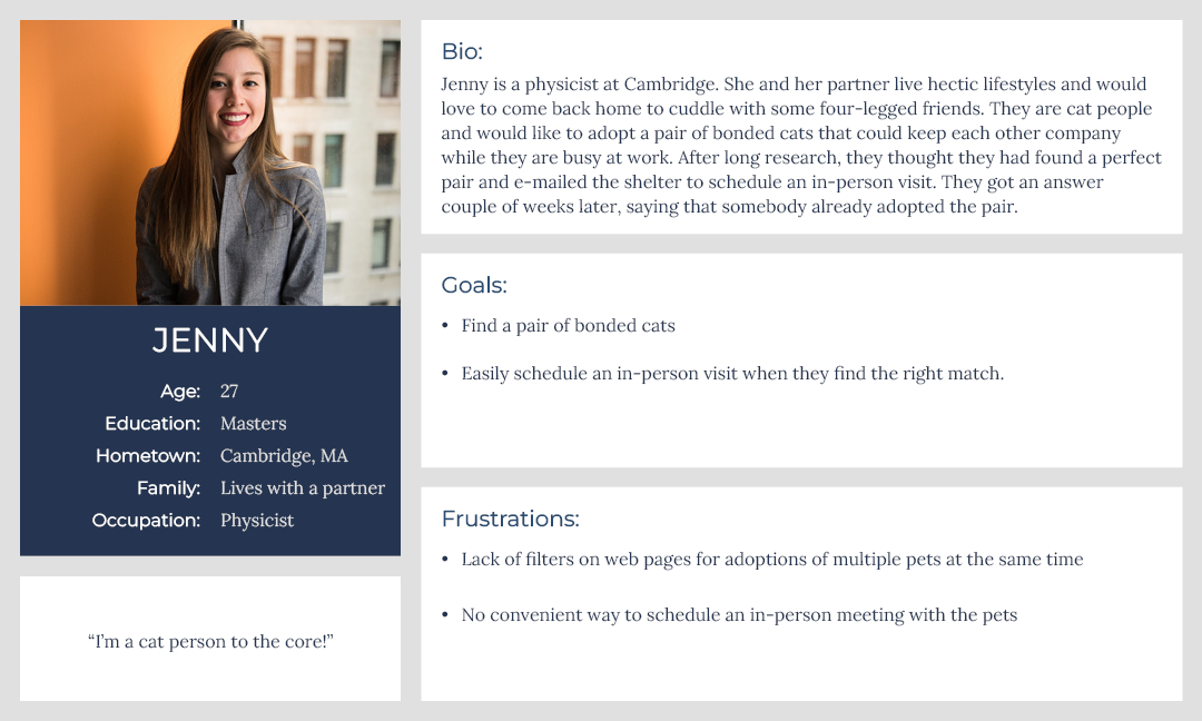
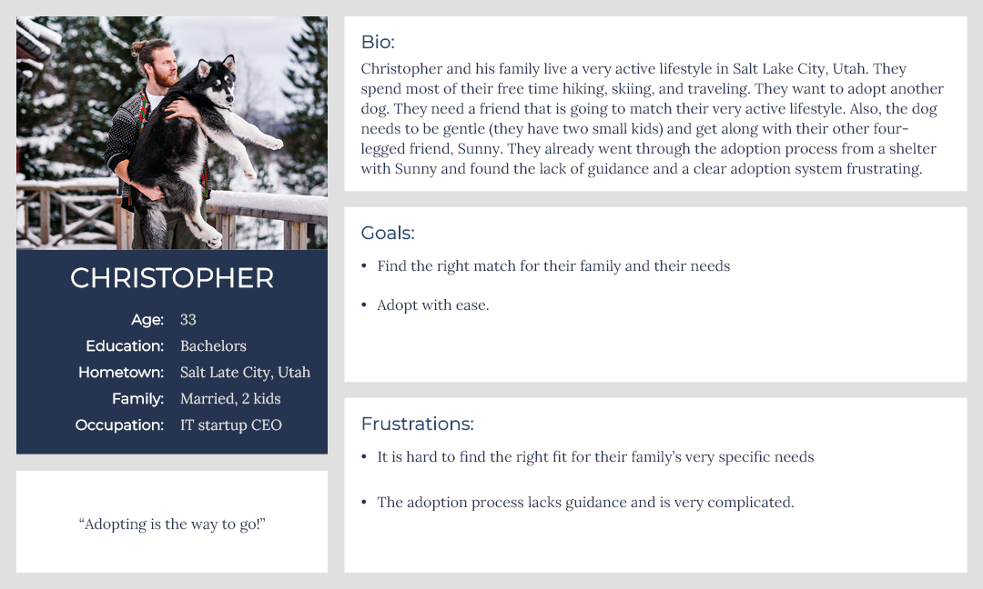
User Personas:
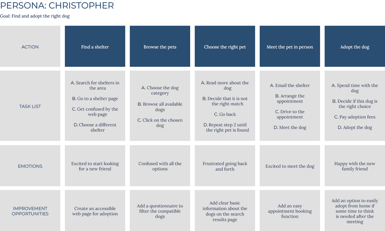
After identifying user problems, user personas and journey maps were created. Mapping Christopher’s journey helped me understand what problems users might encounter when adopting a pet.
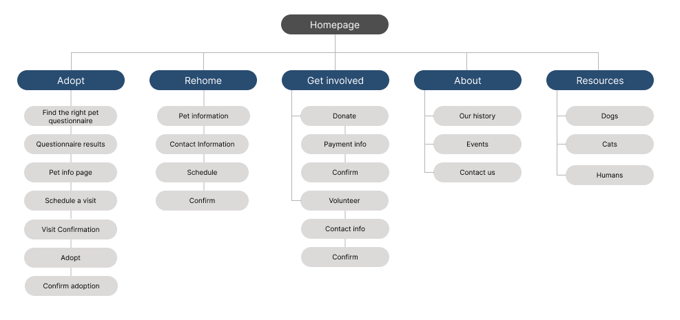
I started the design process by creating a sitemap to fully understand the website structure and make navigation easy. I aimed to make information architecture decisions that would make the navigation intuitive and simple.
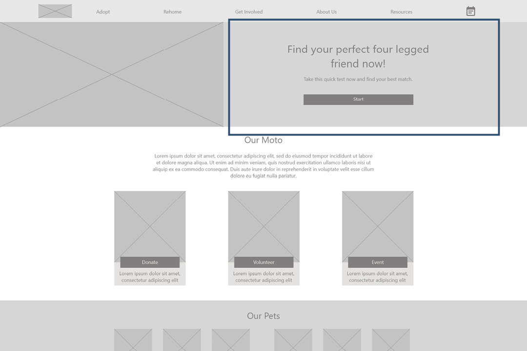
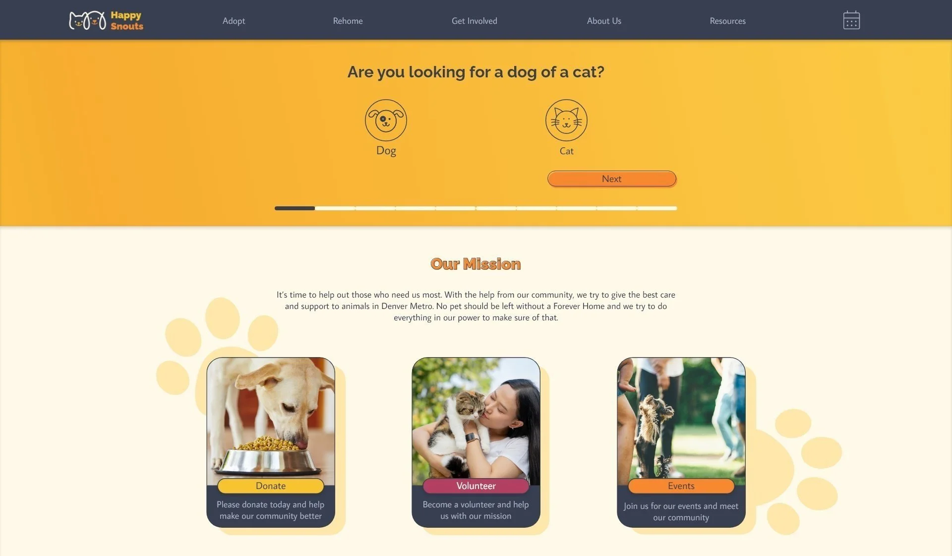
To make finding the right match easier, I developed a flow that includes a compatibility test and makes the adoption process as straightforward as possible. After that, I focused on the adoption flow specifically.
Starting the design
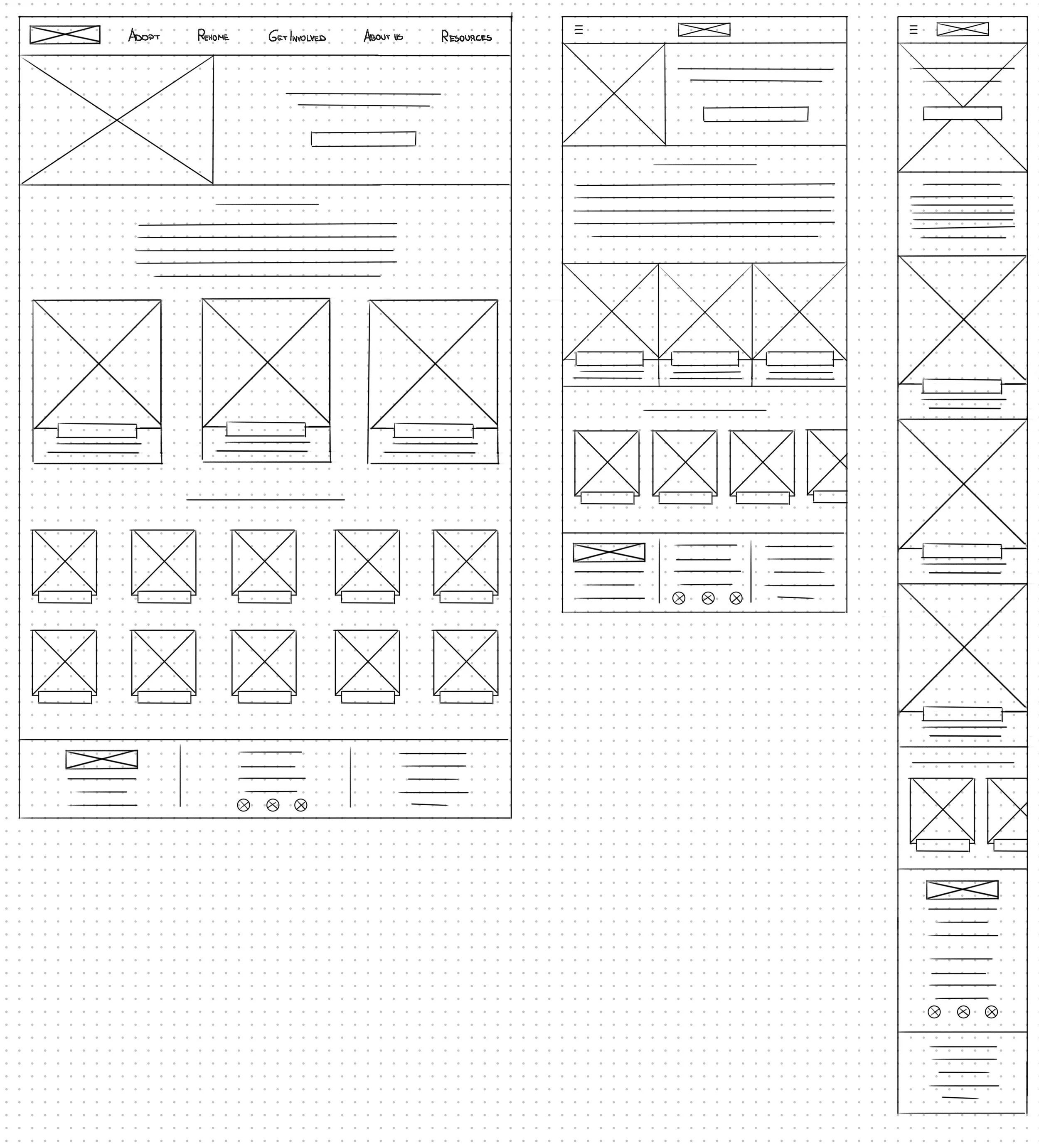
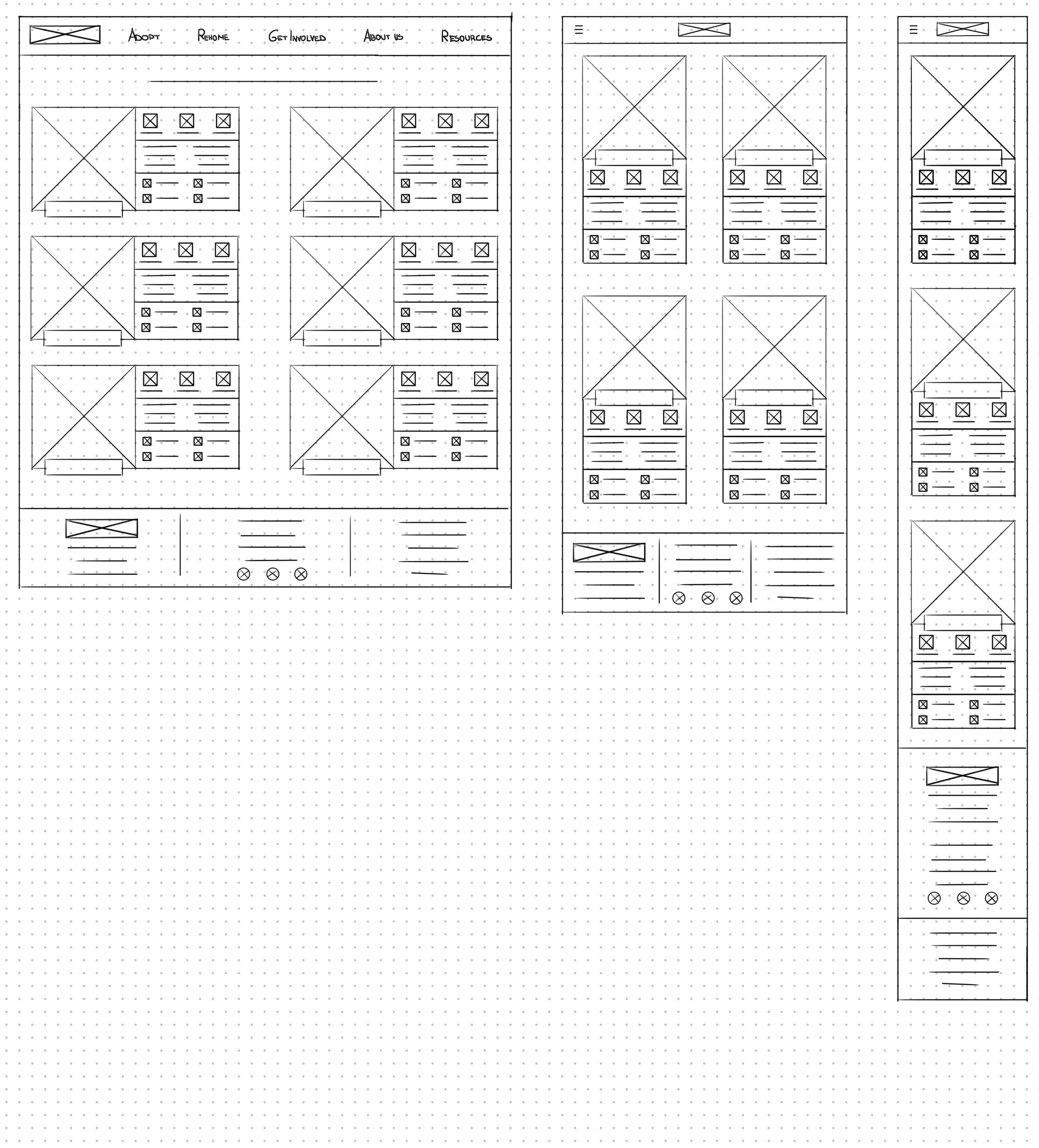
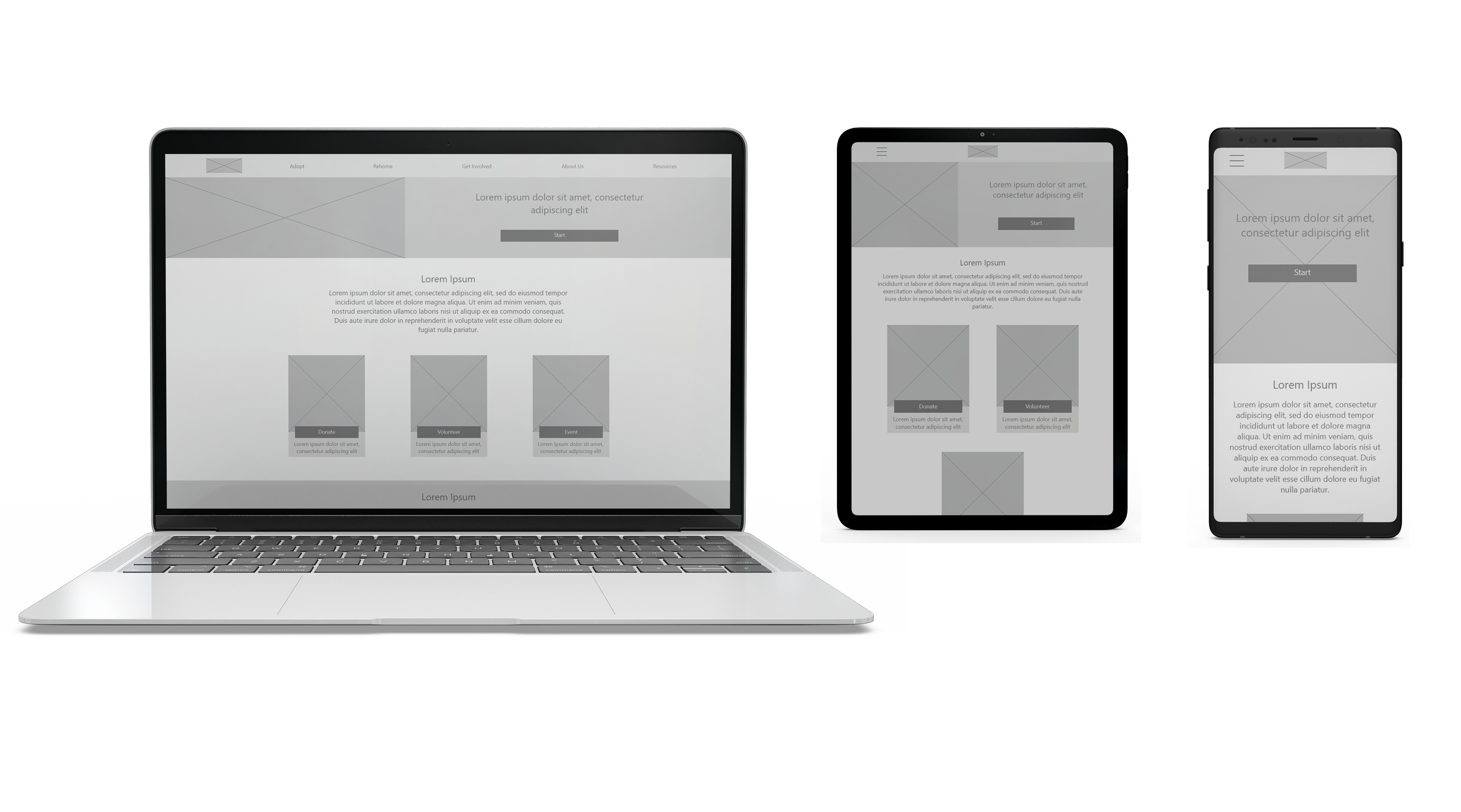
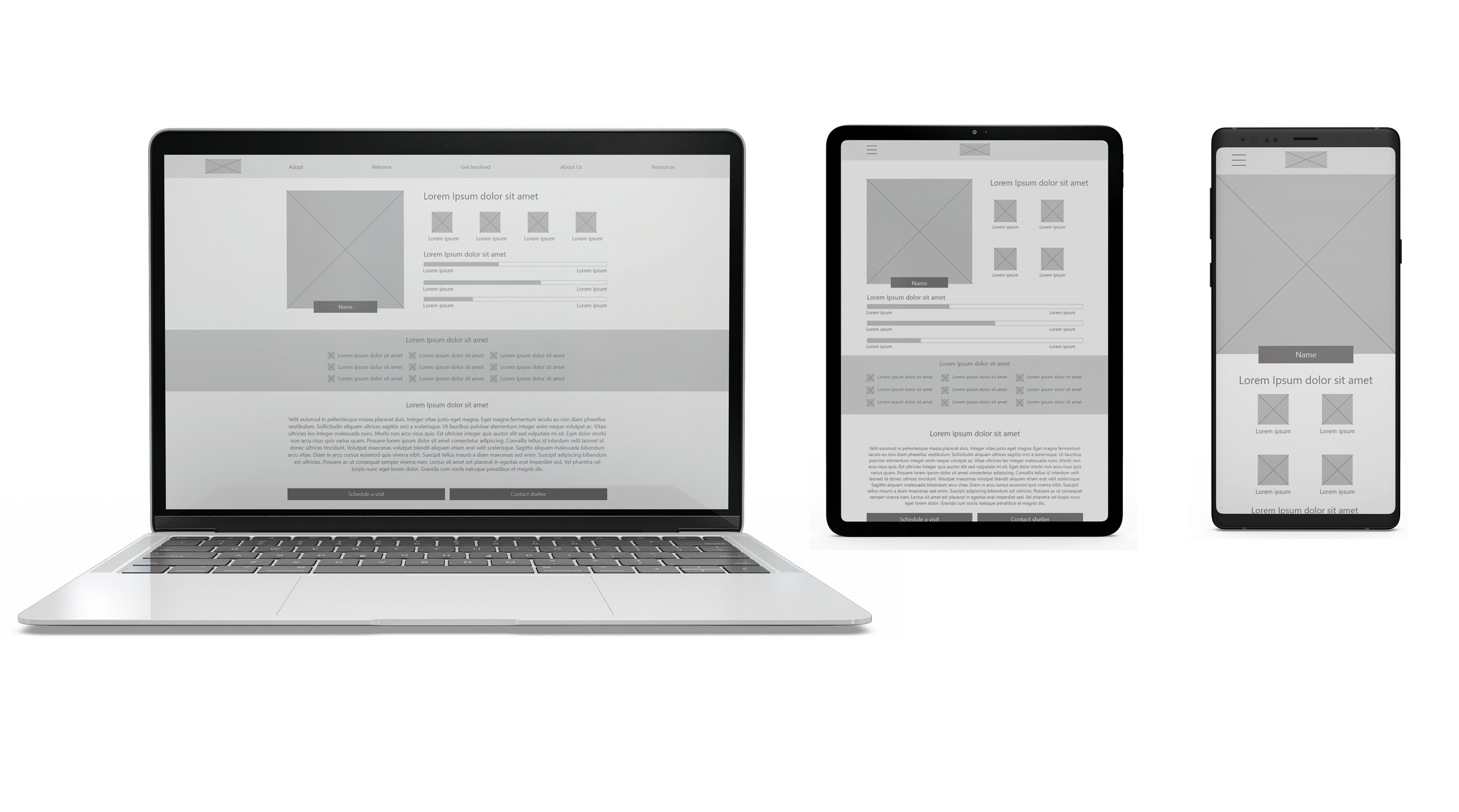
I continued the design process by sketching multiple versions of every screen and marking what I liked the most. I explored numerous different ideas and constantly went back and forth to create a flow that made a smooth user experience. After that, I sketched additional screen sizes to make the design responsive.
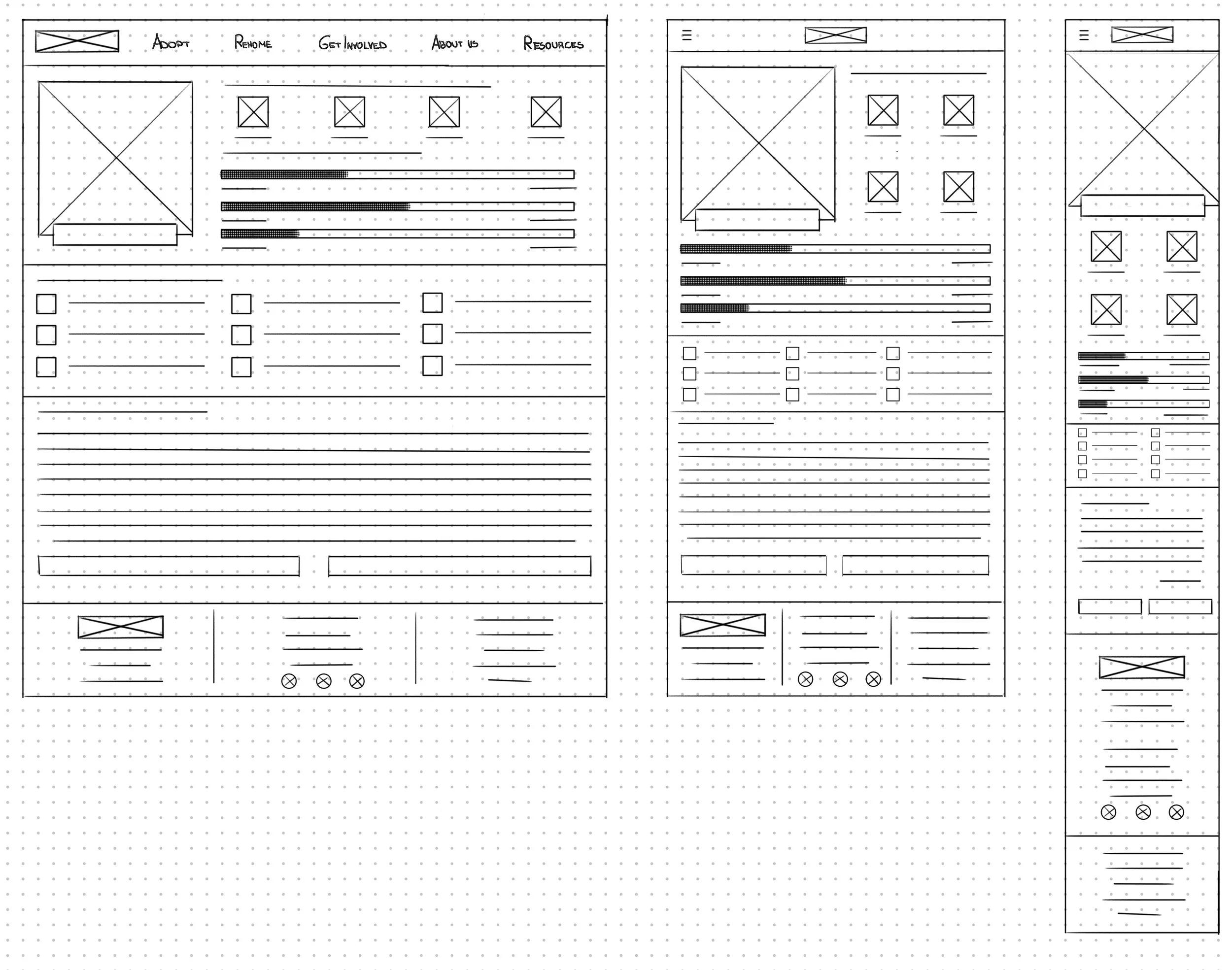
One of the primary user pain points found through user research was how complicated finding the right pet can get. To solve this problem, I included a compatibility test in my user flow.
Digital wireframes:
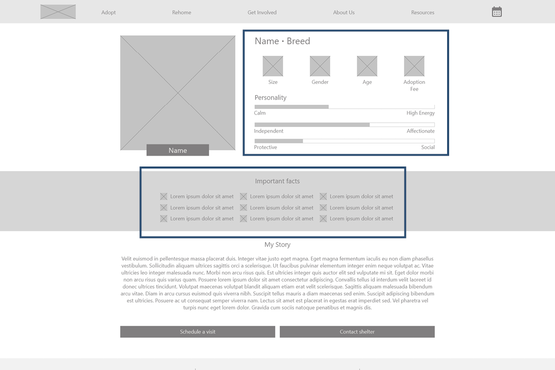
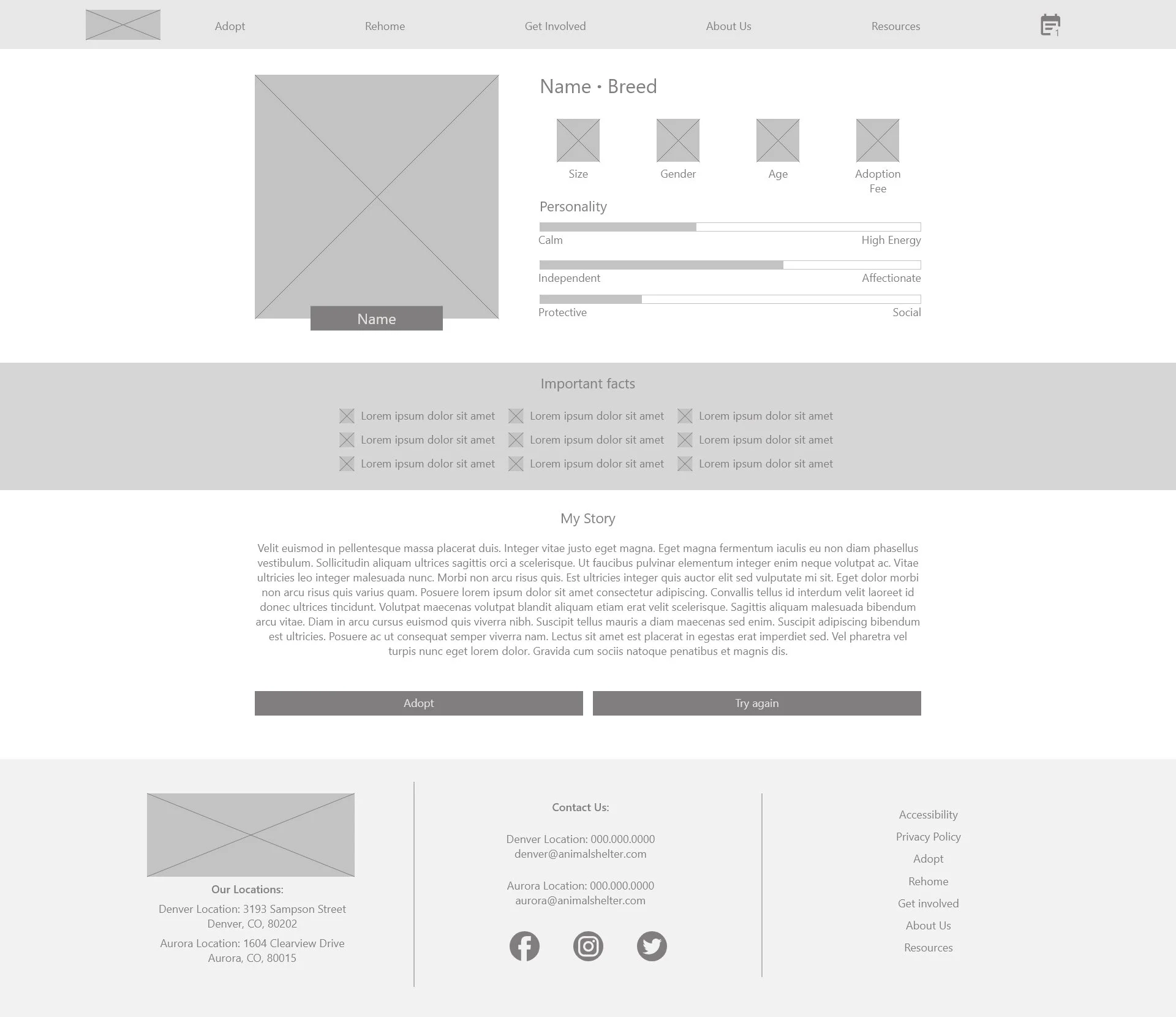
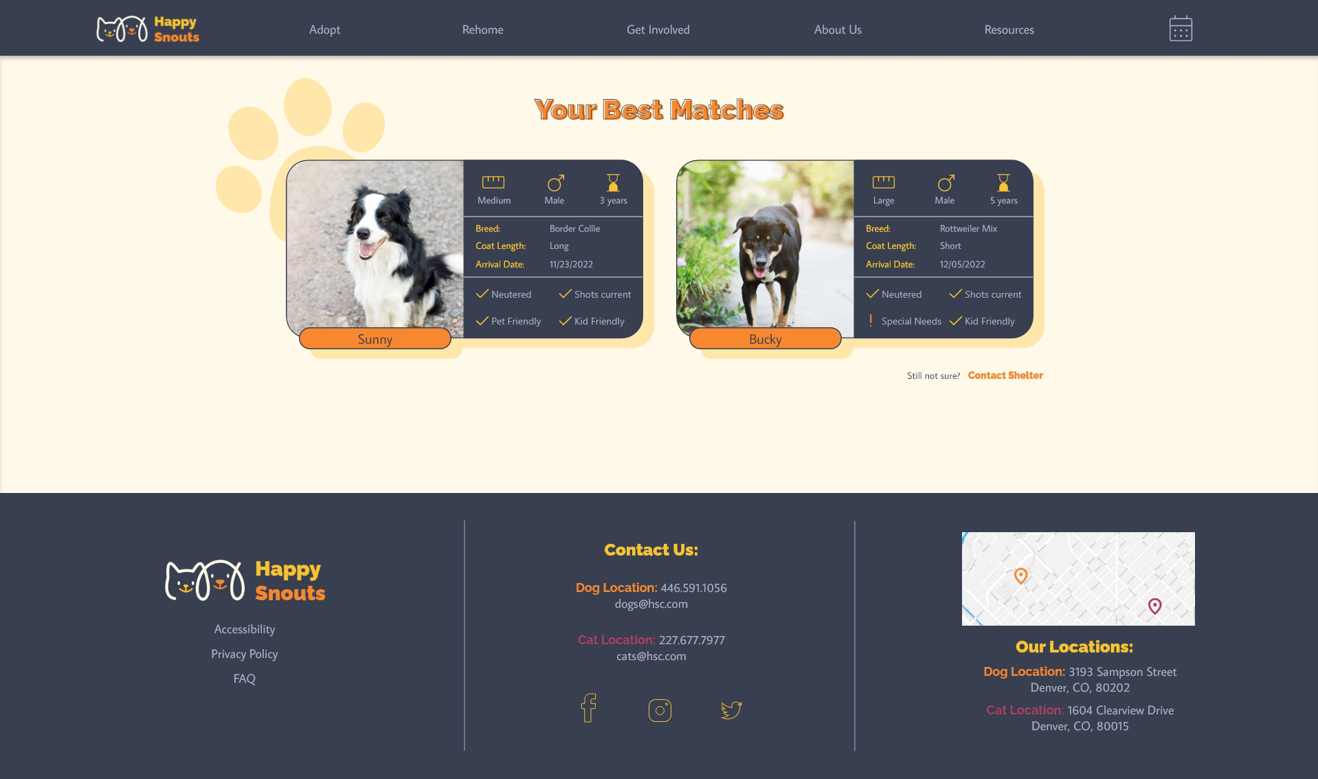
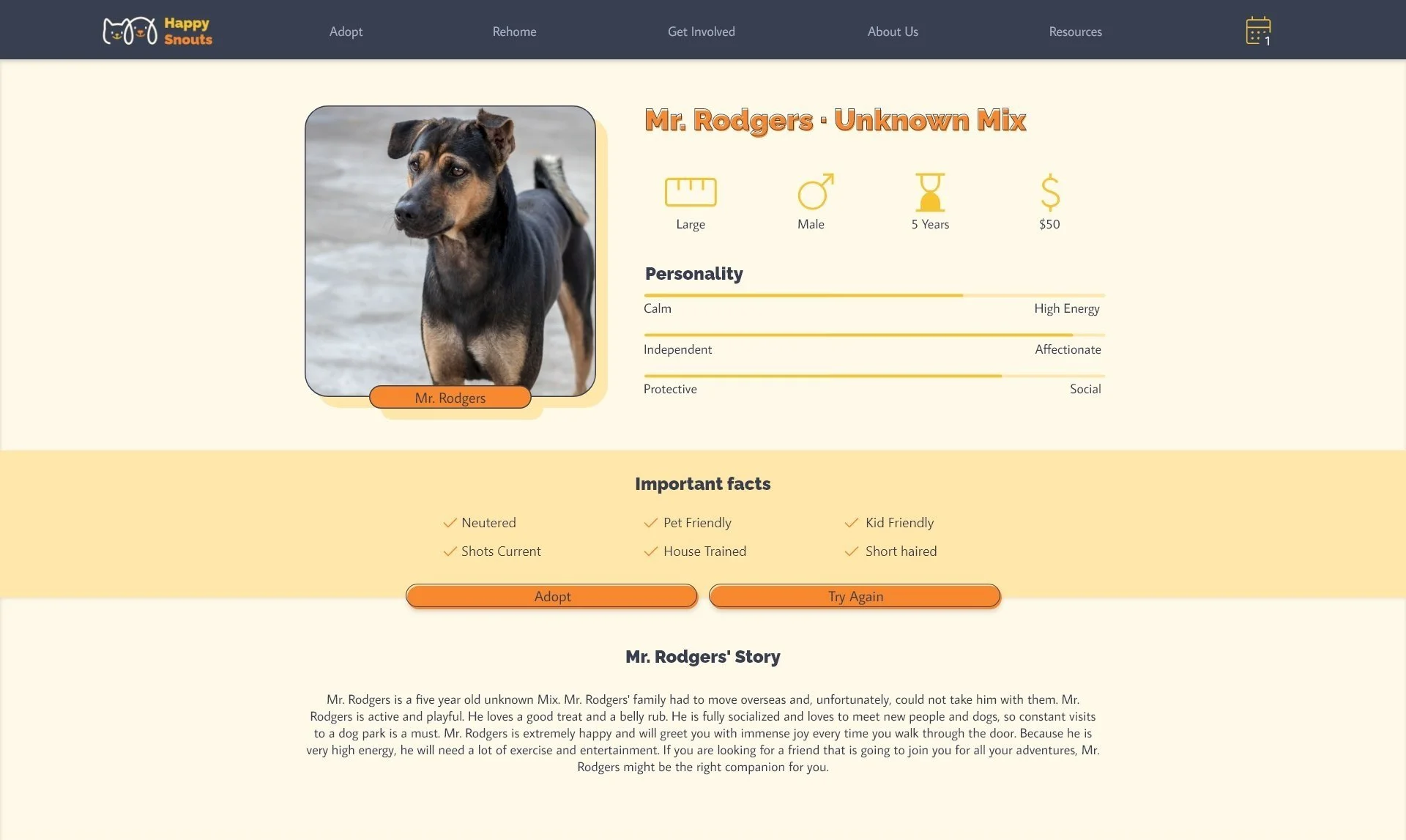
The second pain point expressed was the lack of detailed descriptions of the pets. Making the most important information about the pet front and center makes it easy to quickly skim the most important information before reading the more detailed description.
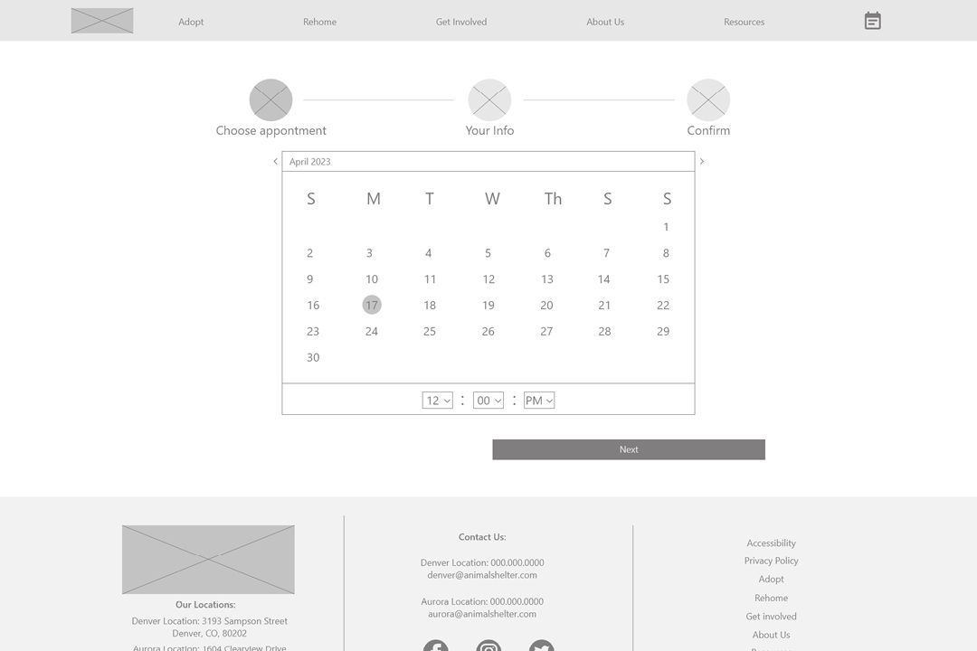
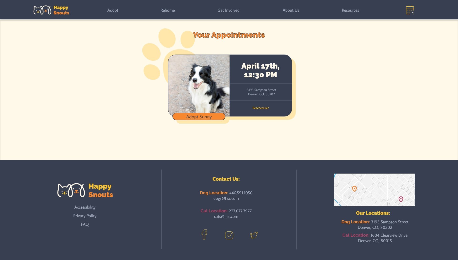
Another pain point expressed was a lack of possibility to schedule meetings online on most animal shelter websites. The ability to schedule an appointment online makes it easy for users to meet the right pet at the time that works for them.
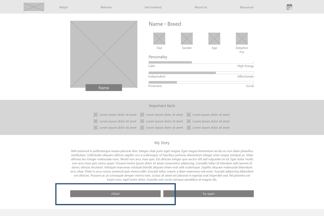
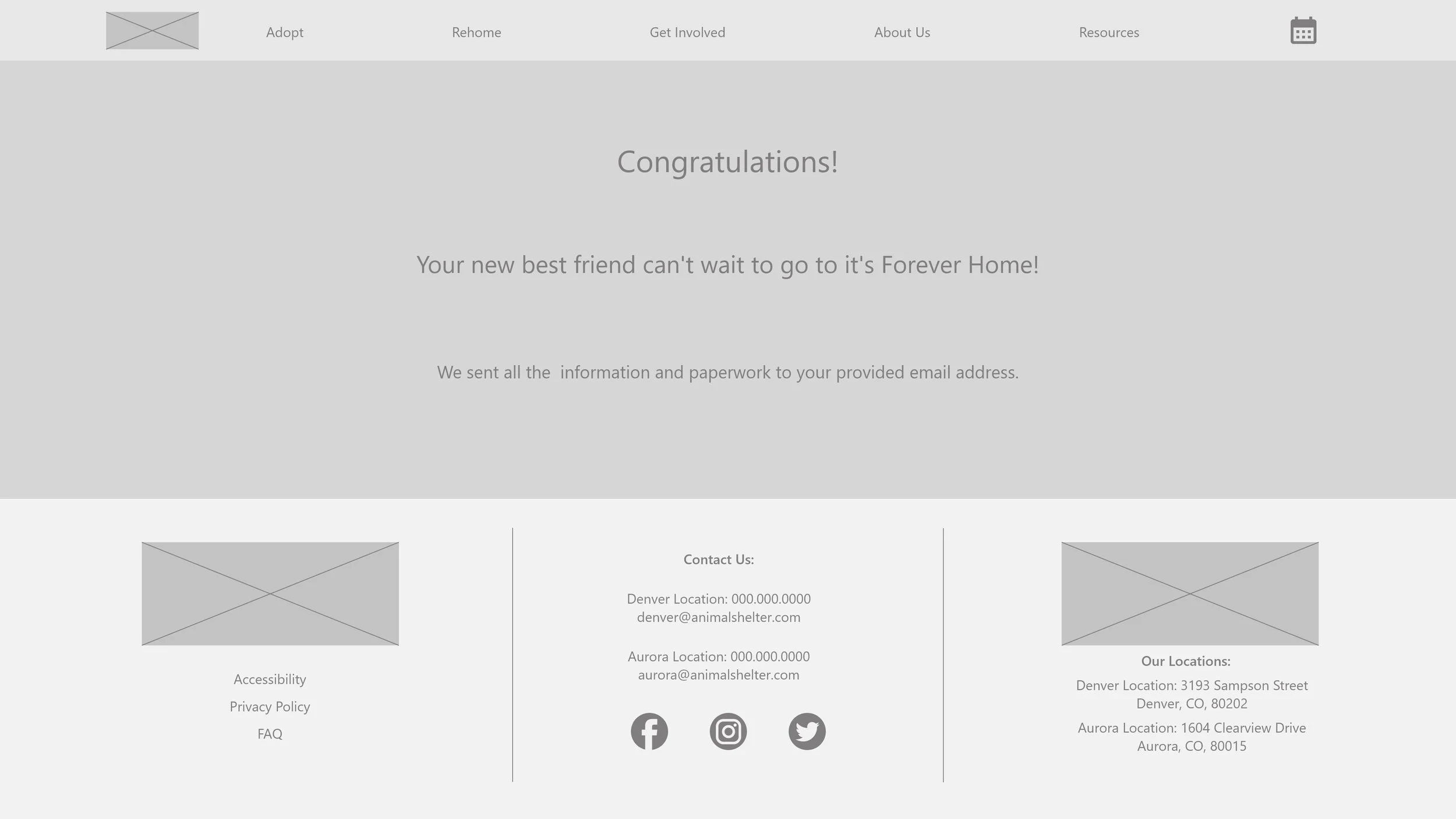
The last pain point expressed was getting overwhelmed during the adoption process. No ability to adopt online makes users feel they must rush their decisions. Adopting straight from the website after meeting the pet makes this process easy
Screen size variations and low fidelity prototype:
Next, I wireframed additional screen sizes to make my website responsive and created a low-fidelity prototype of the main user flow, which I later tested in a usability study.
Usability study findings:
Explanation
After scheduling the appointment, users needed more explanations on the next steps of the adoption process.
Adoption Confirmation
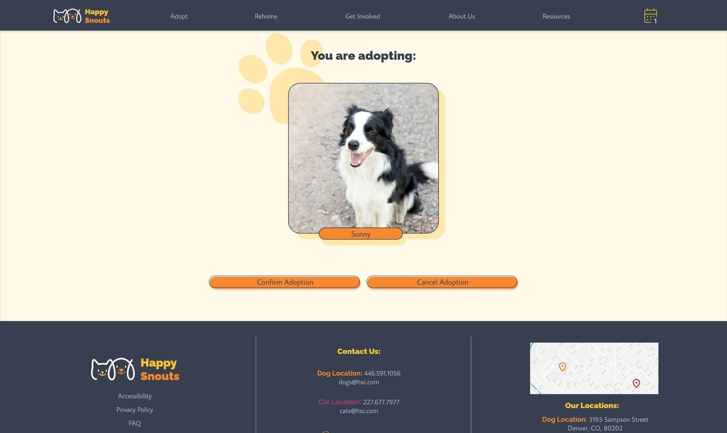
Users lacked a “Confirm Adoption” screen before adopting.
Action buttons
Users found scrolling to the bottom of the pet page to reach the action buttons confusing.
Adopt button
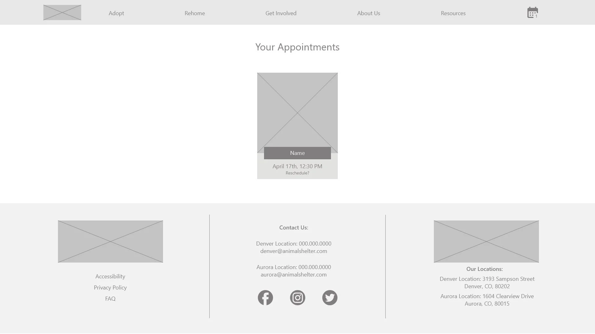
Users wanted an “Adopt” button on the appointment page without needing to go to the pet page again.
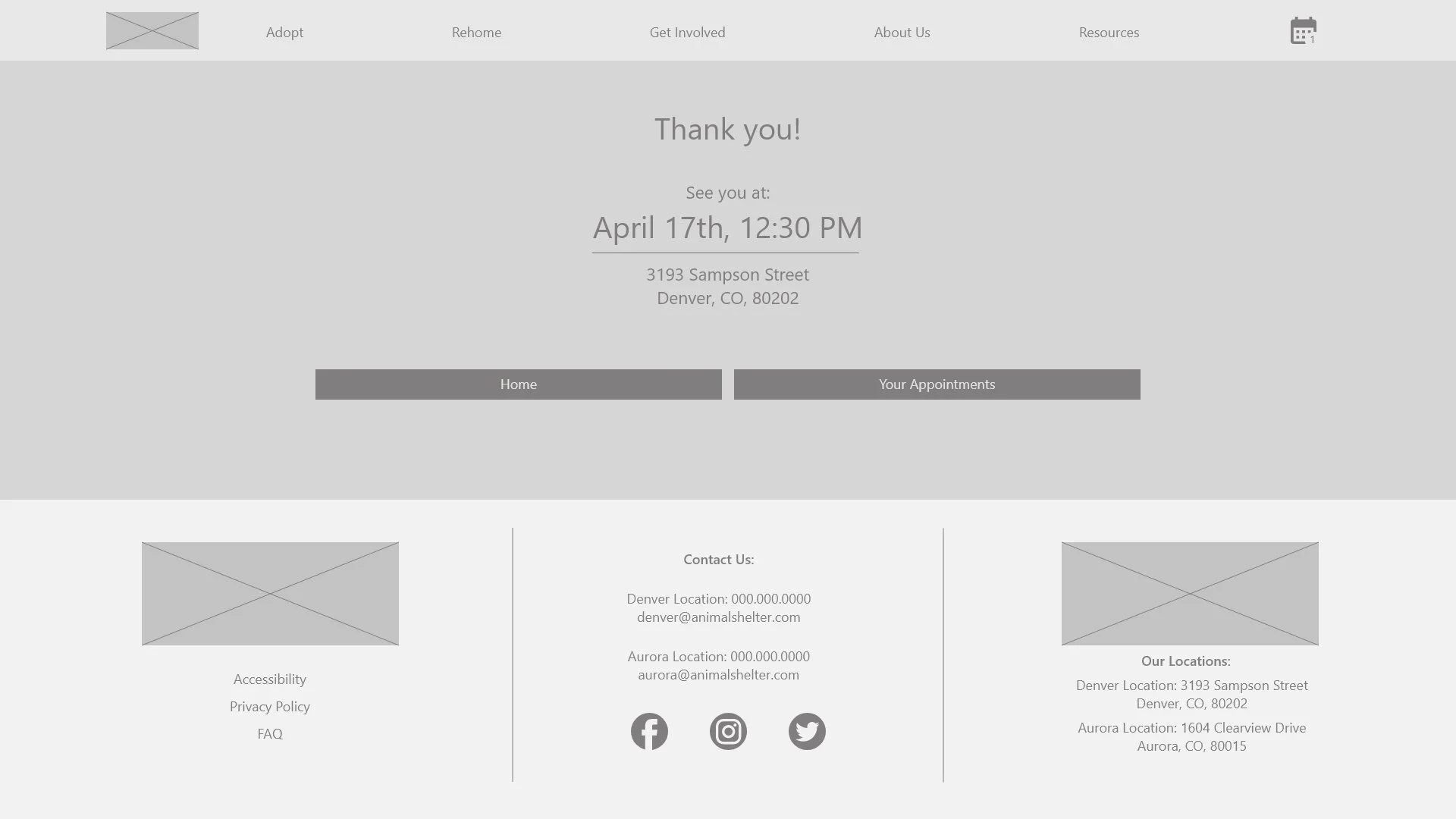
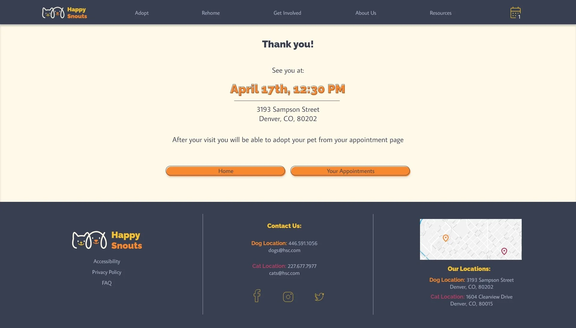
An explanation of the next steps after scheduling an appointment was added to the appointment confirmation page.
Refining the design
Action buttons on the pet page were moved up, eliminating the need to scroll down to reach them.

A “Confirm Adoption” page was added to the flow
An adoption button was added to the appointment page, eliminating the need to visit the pet page again after the appointment.
Original size mockups an high fidelity prototype:
Next, I refined the design and created a high-fidelity prototype of the main user flow for additional user testing.
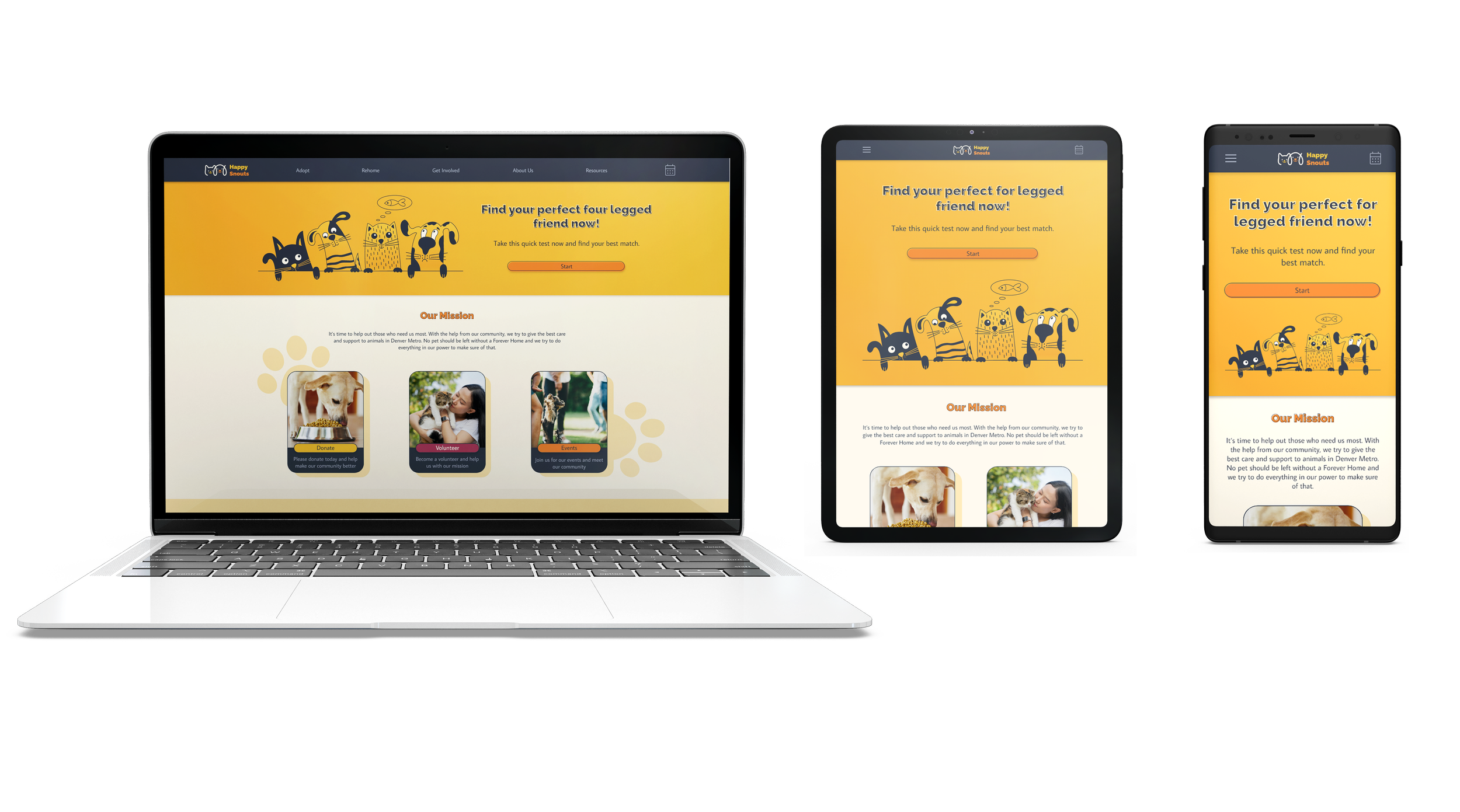
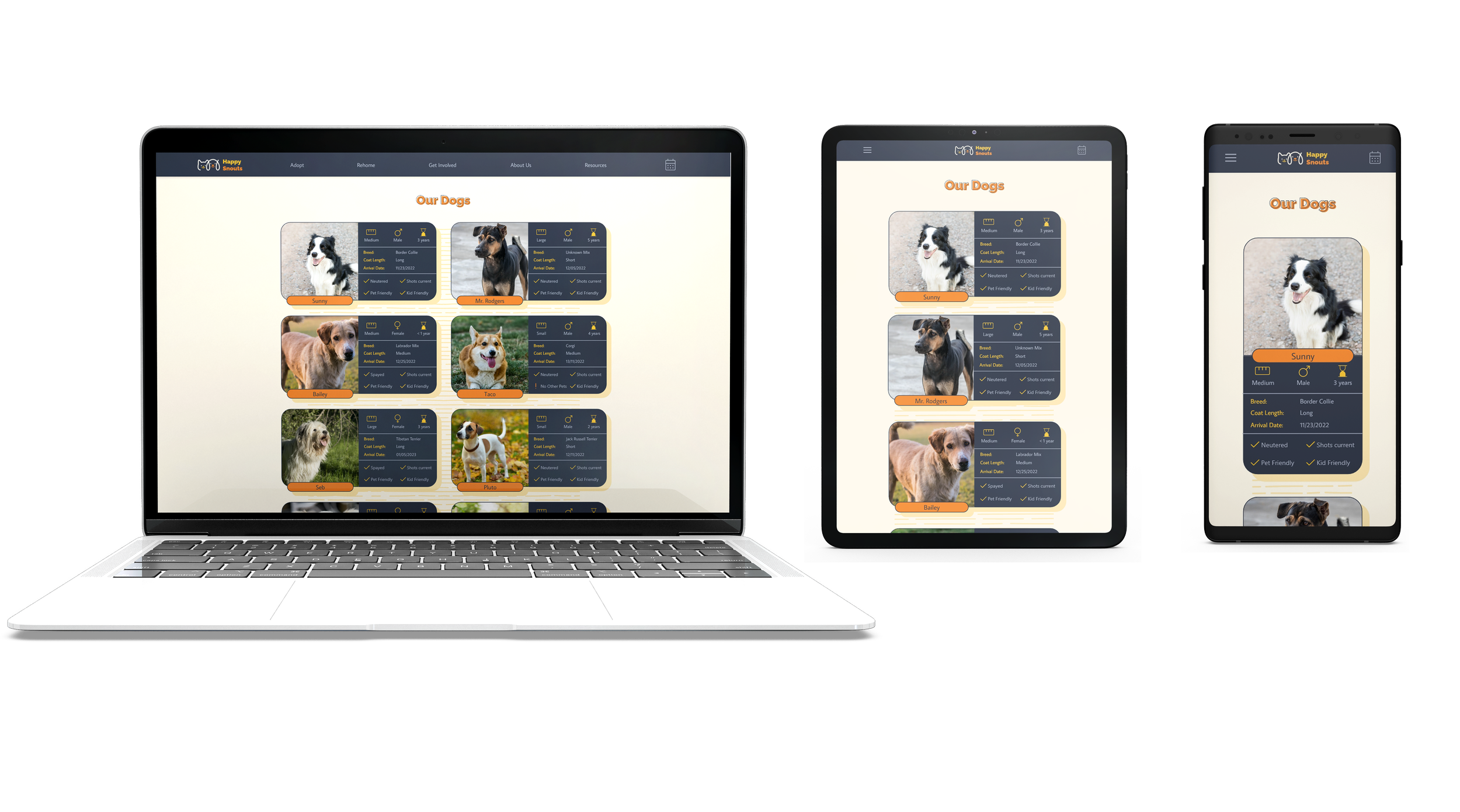
Screen size variations
Final Thoughts:
While designing the website, I learned that user testing is crucial because, after a long time working on the same project, tunnel vision happens, and some obvious issues with the design become not noticeable.
For the following steps, I would like to conduct another round of usability studies to see if the implemented changes effectively addressed the user pain points. I would also like to test if the colorful and cheerful tone is effective in pet adoption.